 ++++
++++Notebook converted from Jupyter for blog publishing.
03-Kmeans-Clustering-Project-Solutions
CIA Country Analysis and Clustering
Source: All these data sets are made up of data from the US government. https://www.cia.gov/library/publications/the-world-factbook/docs/faqs.html (opens in a new tab)
Goal:
Gain insights into similarity between countries and regions of the world by experimenting with different cluster amounts. What do these clusters represent? Note: There is no 100% right answer, make sure to watch the video for thoughts.
Imports and Data
TASK: Run the following cells to import libraries and read in data.
import numpy as np
import pandas as pd
import matplotlib.pyplot as plt
import seaborn as sns
df = pd.read_csv('../DATA/CIA_Country_Facts.csv')Exploratory Data Analysis
TASK: Explore the rows and columns of the data as well as the data types of the columns.
# CODE HEREdf.head()Country
Region
Population
Area (sq. mi.)
Pop. Density (per sq. mi.)df.info()<class 'pandas.core.frame.DataFrame'>
RangeIndex: 227 entries, 0 to 226
Data columns (total 20 columns):
# Column Non-Null Count Dtype
--- ------ -------------- ----- df.describe().transpose()count
mean
std
min
25%Exploratory Data Analysis
Let's create some visualizations. Please feel free to expand on these with your own analysis and charts!
TASK: Create a histogram of the Population column.
# CODE HEREsns.histplot(data=df,x='Population')<AxesSubplot:xlabel='Population', ylabel='Count'>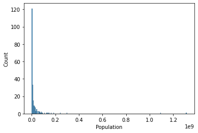
TASK: You should notice the histogram is skewed due to a few large countries, reset the X axis to only show countries with less than 0.5 billion people
#CODE HEREsns.histplot(data=df[df['Population']<500000000],x='Population')<AxesSubplot:xlabel='Population', ylabel='Count'>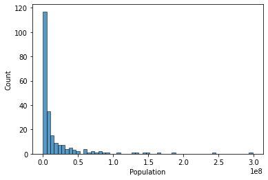
TASK: Now let's explore GDP and Regions. Create a bar chart showing the mean GDP per Capita per region (recall the black bar represents std).
# CODE HEREplt.figure(figsize=(10,6),dpi=200)
sns.barplot(data=df,y='GDP ($ per capita)',x='Region',estimator=np.mean)
plt.xticks(rotation=90);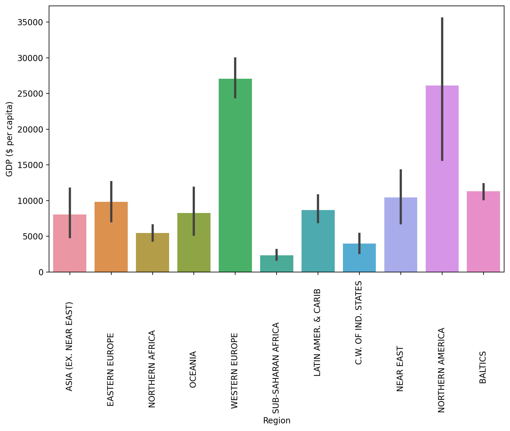
TASK: Create a scatterplot showing the relationship between Phones per 1000 people and the GDP per Capita. Color these points by Region.
#CODE HEREplt.figure(figsize=(10,6),dpi=200)
sns.scatterplot(data=df,x='GDP ($ per capita)',y='Phones (per 1000)',hue='Region')
plt.legend(loc=(1.05,0.5))<matplotlib.legend.Legend at 0x194e5896160>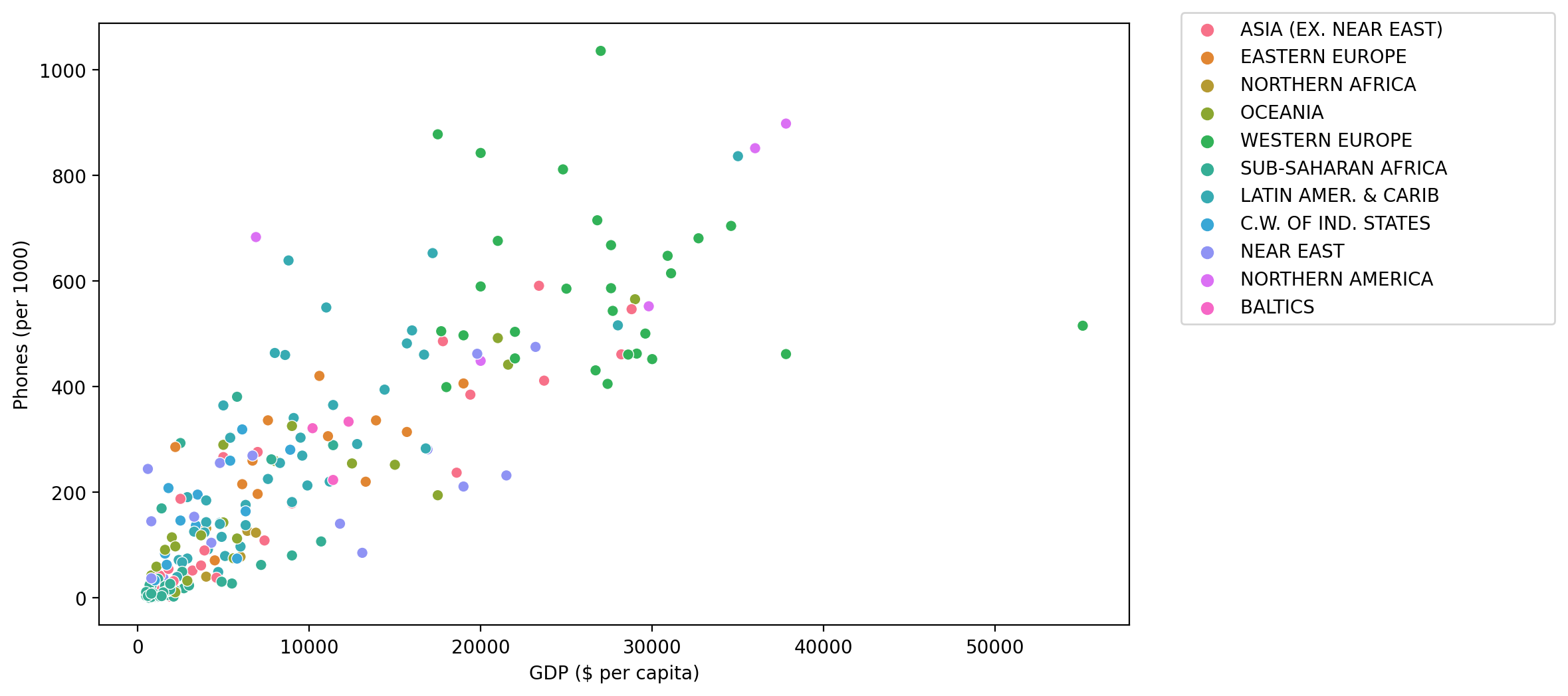
TASK: Create a scatterplot showing the relationship between GDP per Capita and Literacy (color the points by Region). What conclusions do you draw from this plot?
#CODE HEREplt.figure(figsize=(10,6),dpi=200)
sns.scatterplot(data=df,x='GDP ($ per capita)',y='Literacy (%)',hue='Region')<AxesSubplot:xlabel='GDP ($ per capita)', ylabel='Literacy (%)'>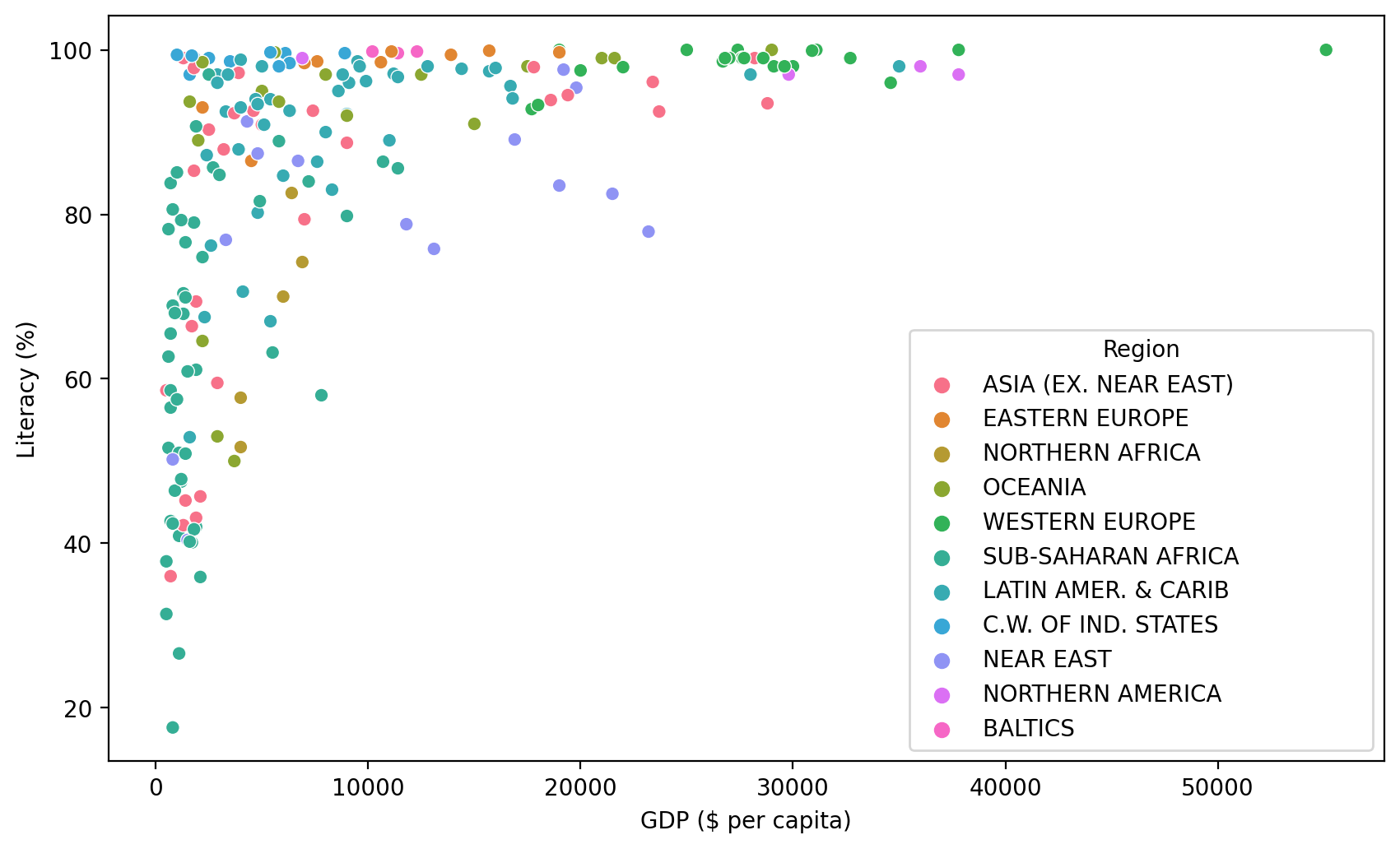
TASK: Create a Heatmap of the Correlation between columns in the DataFrame.
#CODE HEREsns.heatmap(df.corr())<AxesSubplot:>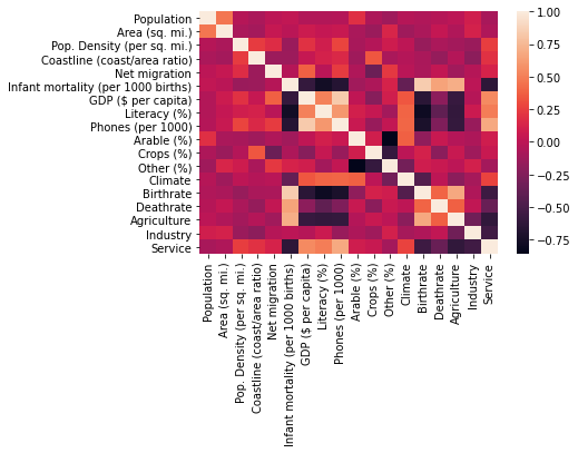
TASK: Seaborn can auto perform hierarchal clustering through the clustermap() function. Create a clustermap of the correlations between each column with this function.
# CODE HEREsns.clustermap(df.corr())<seaborn.matrix.ClusterGrid at 0x194e3dc53d0>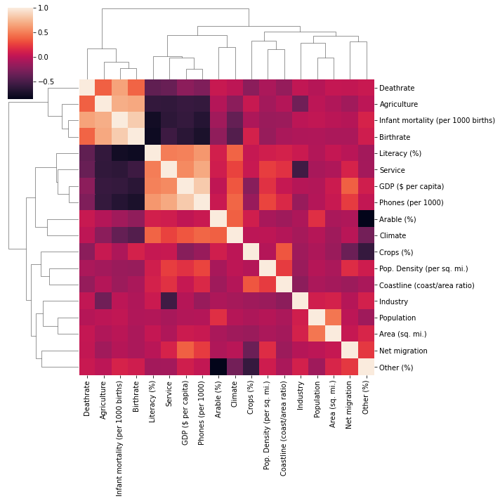
Data Preparation and Model Discovery
Let's now prepare our data for Kmeans Clustering!
Missing Data
TASK: Report the number of missing elements per column.
#CODE HEREdf.isnull().sum()Country 0
Region 0
Population 0
Area (sq. mi.) 0
Pop. Density (per sq. mi.) 0TASK: What countries have NaN for Agriculture? What is the main aspect of these countries?
df[df['Agriculture'].isnull()]['Country']3 American Samoa
4 Andorra
78 Gibraltar
80 Greenland
83 GuamTASK: You should have noticed most of these countries are tiny islands, with the exception of Greenland and Western Sahara. Go ahead and fill any of these countries missing NaN values with 0, since they are so small or essentially non-existant. There should be 15 countries in total you do this for. For a hint on how to do this, recall you can do the following:
df[df['feature'].isnull()]
# REMOVAL OF TINY ISLANDS
df[df['Agriculture'].isnull()] = df[df['Agriculture'].isnull()].fillna(0)
TASK: Now check to see what is still missing by counting number of missing elements again per feature:
#CODE HEREdf.isnull().sum()Country 0
Region 0
Population 0
Area (sq. mi.) 0
Pop. Density (per sq. mi.) 0TASK: Notice climate is missing for a few countries, but not the Region! Let's use this to our advantage. Fill in the missing Climate values based on the mean climate value for its region.
Hints on how to do this: https://stackoverflow.com/questions/19966018/pandas-filling-missing-values-by-mean-in-each-group (opens in a new tab)
# CODE HERE# https://stackoverflow.com/questions/19966018/pandas-filling-missing-values-by-mean-in-each-group
df['Climate'] = df['Climate'].fillna(df.groupby('Region')['Climate'].transform('mean'))TASK: Check again on many elements are missing:
#CODE HEREdf.isnull().sum()Country 0
Region 0
Population 0
Area (sq. mi.) 0
Pop. Density (per sq. mi.) 0TASK: It looks like Literacy percentage is missing. Use the same tactic as we did with Climate missing values and fill in any missing Literacy % values with the mean Literacy % of the Region.
#CODE HEREdf[df['Literacy (%)'].isnull()]Country
Region
Population
Area (sq. mi.)
Pop. Density (per sq. mi.)# https://stackoverflow.com/questions/19966018/pandas-filling-missing-values-by-mean-in-each-group
df['Literacy (%)'] = df['Literacy (%)'].fillna(df.groupby('Region')['Literacy (%)'].transform('mean'))TASK: Check again on the remaining missing values:
df.isnull().sum()Country 0
Region 0
Population 0
Area (sq. mi.) 0
Pop. Density (per sq. mi.) 0TASK: Optional: We are now missing values for only a few countries. Go ahead and drop these countries OR feel free to fill in these last few remaining values with any preferred methodology. For simplicity, we will drop these.
# CODE HEREdf = df.dropna()Data Feature Preparation
TASK: It is now time to prepare the data for clustering. The Country column is still a unique identifier string, so it won't be useful for clustering, since its unique for each point. Go ahead and drop this Country column.
#CODE HEREX = df.drop("Country",axis=1)TASK: Now let's create the X array of features, the Region column is still categorical strings, use Pandas to create dummy variables from this column to create a finalzed X matrix of continuous features along with the dummy variables for the Regions.
#COde hereX = pd.get_dummies(X)X.head()Population
Area (sq. mi.)
Pop. Density (per sq. mi.)
Coastline (coast/area ratio)
Net migrationScaling
TASK: Due to some measurements being in terms of percentages and other metrics being total counts (population), we should scale this data first. Use Sklearn to scale the X feature matrics.
#CODE HEREfrom sklearn.preprocessing import StandardScalerscaler = StandardScaler()
scaled_X = scaler.fit_transform(X)scaled_Xarray([[ 0.0133285 , 0.01855412, -0.20308668, ..., -0.31544015,
-0.54772256, -0.36514837],
[-0.21730118, -0.32370888, -0.14378531, ..., -0.31544015,
-0.54772256, -0.36514837],
[ 0.02905136, 0.97784988, -0.22956327, ..., -0.31544015,Creating and Fitting Kmeans Model
TASK: Use a for loop to create and fit multiple KMeans models, testing from K=2-30 clusters. Keep track of the Sum of Squared Distances for each K value, then plot this out to create an "elbow" plot of K versus SSD. Optional: You may also want to create a bar plot showing the SSD difference from the previous cluster.
#CODE HEREfrom sklearn.cluster import KMeansssd = []
for k in range(2,30):
model = KMeans(n_clusters=k)
model.fit(scaled_X)
#Sum of squared distances of samples to their closest cluster center.
ssd.append(model.inertia_)plt.plot(range(2,30),ssd,'o--')
plt.xlabel("K Value")
plt.ylabel(" Sum of Squared Distances")Text(0, 0.5, ' Sum of Squared Distances')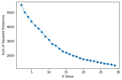
pd.Series(ssd).diff().plot(kind='bar')<AxesSubplot:>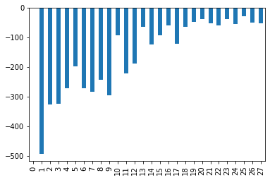
Model Interpretation
TASK: What K value do you think is a good choice? Are there multiple reasonable choices? What features are helping define these cluster choices. As this is unsupervised learning, there is no 100% correct answer here. Please feel free to jump to the solutions for a full discussion on this!.
# Nothing to really code here, but choose a K value and see what features
# are most correlated to belonging to a particular cluster!

# Remember, there is no 100% correct answer here!
Example Interpretation: Choosing K=3
One could say that there is a significant drop off in SSD difference at K=3 (although we can see it continues to drop off past this). What would an analysis look like for K=3? Let's explore which features are important in the decision of 3 clusters!
model = KMeans(n_clusters=3)
model.fit(scaled_X)KMeans(n_clusters=3)model.labels_array([2, 0, 0, 0, 1, 2, 0, 0, 0, 0, 1, 1, 1, 0, 0, 0, 2, 1, 1, 1, 0, 2,
1, 2, 0, 1, 2, 0, 1, 0, 1, 2, 2, 2, 2, 2, 1, 0, 1, 2, 2, 0, 0, 0,
2, 2, 2, 0, 2, 1, 0, 1, 1, 2, 0, 0, 0, 0, 0, 2, 2, 1, 2, 1, 0, 1,
1, 0, 0, 2, 2, 0, 0, 1, 2, 1, 1, 0, 0, 0, 0, 0, 2, 2, 0, 2, 0, 1,
1, 1, 0, 0, 0, 0, 1, 1, 1, 1, 0, 1, 1, 0, 0, 2, 0, 0, 1, 0, 0, 2,X['K=3 Clusters'] = model.labels_X.corr()['K=3 Clusters'].sort_values()Literacy (%) -0.419453
Region_LATIN AMER. & CARIB -0.377533
Region_OCEANIA -0.248224
Crops (%) -0.245934
Phones (per 1000) -0.198737BONUS CHALLGENGE:
Geographical Model Interpretation
The best way to interpret this model is through visualizing the clusters of countries on a map! NOTE: THIS IS A BONUS SECTION. YOU MAY WANT TO JUMP TO THE SOLUTIONS LECTURE FOR A FULL GUIDE, SINCE WE WILL COVER TOPICS NOT PREVIOUSLY DISCUSSED AND BE HAVING A NUANCED DISCUSSION ON PERFORMANCE!
IF YOU GET STUCK, PLEASE CHECK OUT THE SOLUTIONS LECTURE. AS THIS IS OPTIONAL AND COVERS MANY TOPICS NOT SHOWN IN ANY PREVIOUS LECTURE
TASK: Create cluster labels for a chosen K value. Based on the solutions, we believe either K=3 or K=15 are reasonable choices. But feel free to choose differently and explore.
model = KMeans(n_clusters=15)

model.fit(scaled_X)KMeans(n_clusters=15)model = KMeans(n_clusters=3)
model.fit(scaled_X)KMeans(n_clusters=3)TASK: Let's put you in the real world! Your boss just asked you to plot out these clusters on a country level choropleth map, can you figure out how to do this? We won't step by step guide you at all on this, just show you an example result. You'll need to do the following:
-
Figure out how to install plotly library: https://plotly.com/python/getting-started/ (opens in a new tab)
-
Figure out how to create a geographical choropleth map using plotly: https://plotly.com/python/choropleth-maps/#using-builtin-country-and-state-geometries (opens in a new tab)
-
You will need ISO Codes for this. Either use the wikipedia page, or use our provided file for this: "../DATA/country_iso_codes.csv"
-
Combine the cluster labels, ISO Codes, and Country Names to create a world map plot with plotly given what you learned in Step 1 and Step 2.
Note: This is meant to be a more realistic project, where you have a clear objective of what you need to create and accomplish and the necessary online documentation. It's up to you to piece everything together to figure it out! If you get stuck, no worries! Check out the solution lecture.
iso_codes = pd.read_csv("../DATA/country_iso_codes.csv")iso_codesCountry
ISO Code
0
Afghanistan
AFGiso_mapping = iso_codes.set_index('Country')['ISO Code'].to_dict()iso_mapping{'Afghanistan': 'AFG',
'Akrotiri and Dhekelia – See United Kingdom, The': 'Akrotiri and Dhekelia – See United Kingdom, The',
'Åland Islands': 'ALA',
'Albania': 'ALB',
'Algeria': 'DZA',df['ISO Code'] = df['Country'].map(iso_mapping)df['Cluster'] = model.labels_import plotly.express as px
fig = px.choropleth(df, locations="ISO Code",
color="Cluster", # lifeExp is a column of gapminder
hover_name="Country", # column to add to hover information
color_continuous_scale='Turbo'
)
fig.show()