 ++++
++++Notebook converted from Jupyter for blog publishing.
01-Linear-Regression-with-Scitkit-Learn
Linear Regression with SciKit-Learn
We saw how to create a very simple best fit line, but now let's greatly expand our toolkit to start thinking about the considerations of overfitting, underfitting, model evaluation, as well as multiple features!
Imports
import numpy as np
import pandas as pd
import matplotlib.pyplot as plt
import seaborn as sns
Sample Data
This sample data is from ISLR. It displays sales (in thousands of units) for a particular product as a function of advertising budgets (in thousands of dollars) for TV, radio, and newspaper media.
df = pd.read_csv("Advertising.csv")df.head()TV
radio
newspaper
sales
0Expanding the Questions
Previously, we explored Is there a relationship between total advertising spend and sales? as well as predicting the total sales for some value of total spend. Now we want to expand this to What is the relationship between each advertising channel (TV,Radio,Newspaper) and sales?
Multiple Features (N-Dimensional)
fig,axes = plt.subplots(nrows=1,ncols=3,figsize=(16,6))

axes[0].plot(df['TV'],df['sales'],'o')
axes[0].set_ylabel("Sales")
axes[0].set_title("TV Spend")

axes[1].plot(df['radio'],df['sales'],'o')
axes[1].set_title("Radio Spend")
axes[1].set_ylabel("Sales")

axes[2].plot(df['newspaper'],df['sales'],'o')
axes[2].set_title("Newspaper Spend");
axes[2].set_ylabel("Sales")
plt.tight_layout();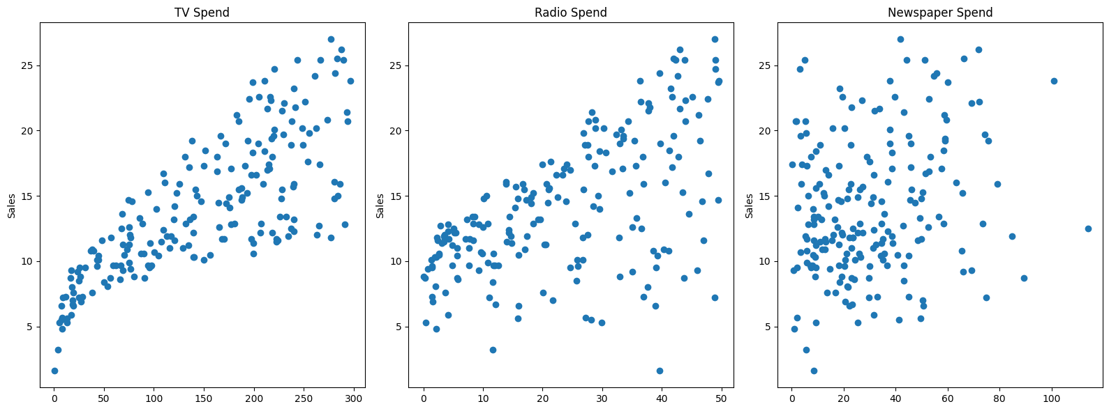
# Relationships between features
sns.pairplot(df,diag_kind='kde')<seaborn.axisgrid.PairGrid at 0x11eb6cb90>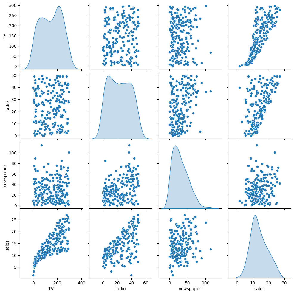
Introducing SciKit Learn
We will work a lot with the scitkit learn library, so get comfortable with its model estimator syntax, as well as exploring its incredibly useful documentation!
X = df.drop('sales',axis=1)
y = df['sales']
Train | Test Split
Make sure you have watched the Machine Learning Overview videos on Supervised Learning to understand why we do this step
from sklearn.model_selection import train_test_split# random_state:
# https://stackoverflow.com/questions/28064634/random-state-pseudo-random-number-in-scikit-learn
X_train, X_test, y_train, y_test = train_test_split(X, y, test_size=0.3, random_state=101)X_trainTV
radio
newspaper
85
193.2y_train85 15.2
183 26.2
127 8.8
53 21.2
100 11.7X_testTV
radio
newspaper
37
74.7y_test37 14.7
109 19.8
31 11.9
89 16.7
66 9.5Creating a Model (Estimator)
Import a model class from a model family
from sklearn.linear_model import LinearRegressionCreate an instance of the model with parameters
help(LinearRegression)Help on class LinearRegression in module sklearn.linear_model._base:
class LinearRegression(sklearn.base.MultiOutputMixin, sklearn.base.RegressorMixin, LinearModel)
| LinearRegression(*, fit_intercept=True, copy_X=True, tol=1e-06, n_jobs=None, positive=False)
|model = LinearRegression()Fit/Train the Model on the training data
Make sure you only fit to the training data, in order to fairly evaluate your model's performance on future data
model.fit(X_train,y_train)LinearRegression()In a Jupyter environment, please rerun this cell to show the HTML representation or trust the notebook.
On GitHub, the HTML representation is unable to render, please try loading this page with nbviewer.org.
LinearRegression
?Documentation for LinearRegressioniFitted
ParametersUnderstanding and utilizing the Model
Evaluation on the Test Set
Metrics
Make sure you've viewed the video on these metrics! The three most common evaluation metrics for regression problems:
Mean Absolute Error (MAE) is the mean of the absolute value of the errors:
Mean Squared Error (MSE) is the mean of the squared errors:
Root Mean Squared Error (RMSE) is the square root of the mean of the squared errors:
Comparing these metrics:
- MAE is the easiest to understand, because it's the average error.
- MSE is more popular than MAE, because MSE "punishes" larger errors, which tends to be useful in the real world.
- RMSE is even more popular than MSE, because RMSE is interpretable in the "y" units.
All of these are loss functions, because we want to minimize them.
Calculate Performance on Test Set
We want to fairly evaluate our model, so we get performance metrics on the test set (data the model has never seen before).
# X_test# We only pass in test features
# The model predicts its own y hat
# We can then compare these results to the true y test label value
test_predictions = model.predict(X_test)test_predictionsarray([15.74131332, 19.61062568, 11.44888935, 17.00819787, 9.17285676,
7.01248287, 20.28992463, 17.29953992, 9.77584467, 19.22194224,
12.40503154, 13.89234998, 13.72541098, 21.28794031, 18.42456638,
9.98198406, 15.55228966, 7.68913693, 7.55614992, 20.40311209,
7.79215204, 18.24214098, 24.68631904, 22.82199068, 7.97962085,from sklearn.metrics import mean_absolute_error,mean_squared_errorMAE = mean_absolute_error(y_test,test_predictions)
MSE = mean_squared_error(y_test,test_predictions)
RMSE = np.sqrt(MSE)MAE1.213745773614481MSE2.2987166978863796RMSE1.5161519375993884df['sales'].mean()14.0225Review our video to understand whether these values are "good enough".
Residuals
Revisiting Anscombe's Quartet: https://en.wikipedia.org/wiki/Anscombe%27s_quartet (opens in a new tab)

quartet = pd.read_csv('anscombes_quartet1.csv')# y = 3.00 + 0.500x
quartet['pred_y'] = 3 + 0.5 * quartet['x']
quartet['residual'] = quartet['y'] - quartet['pred_y']
sns.scatterplot(data=quartet,x='x',y='y')
sns.lineplot(data=quartet,x='x',y='pred_y',color='red')
plt.vlines(quartet['x'],quartet['y'],quartet['y']-quartet['residual'])<matplotlib.collections.LineCollection at 0x21603321888>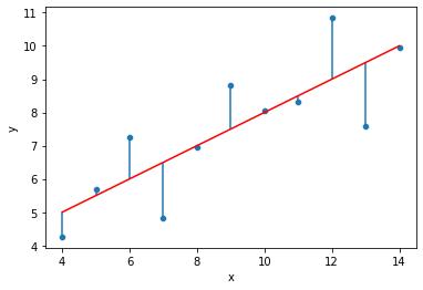
sns.kdeplot(quartet['residual'])<AxesSubplot:xlabel='residual', ylabel='Density'>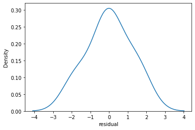
sns.scatterplot(data=quartet,x='y',y='residual')
plt.axhline(y=0, color='r', linestyle='--')<matplotlib.lines.Line2D at 0x216032d8a08>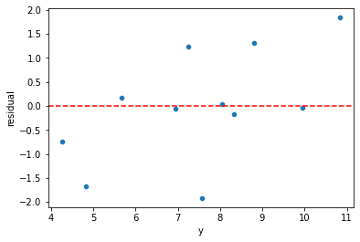
quartet = pd.read_csv('anscombes_quartet2.csv')quartet.columns = ['x','y']# y = 3.00 + 0.500x
quartet['pred_y'] = 3 + 0.5 * quartet['x']
quartet['residual'] = quartet['y'] - quartet['pred_y']
sns.scatterplot(data=quartet,x='x',y='y')
sns.lineplot(data=quartet,x='x',y='pred_y',color='red')
plt.vlines(quartet['x'],quartet['y'],quartet['y']-quartet['residual'])<matplotlib.collections.LineCollection at 0x21603475dc8>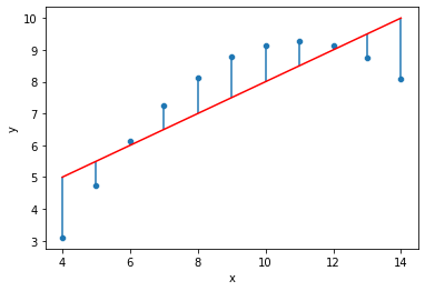
sns.kdeplot(quartet['residual'])<AxesSubplot:xlabel='residual', ylabel='Density'>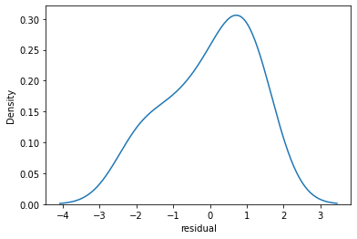
sns.scatterplot(data=quartet,x='y',y='residual')
plt.axhline(y=0, color='r', linestyle='--')<matplotlib.lines.Line2D at 0x21603410fc8>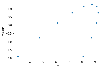
quartet = pd.read_csv('anscombes_quartet4.csv')quartetx
y
0
8.0
6.58# y = 3.00 + 0.500x
quartet['pred_y'] = 3 + 0.5 * quartet['x']quartet['residual'] = quartet['y'] - quartet['pred_y']sns.scatterplot(data=quartet,x='x',y='y')
sns.lineplot(data=quartet,x='x',y='pred_y',color='red')
plt.vlines(quartet['x'],quartet['y'],quartet['y']-quartet['residual'])<matplotlib.collections.LineCollection at 0x216035bf808>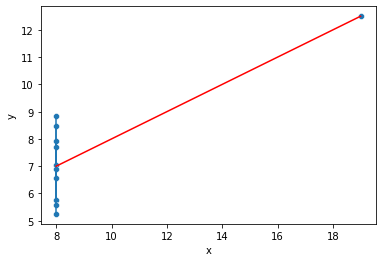
sns.kdeplot(quartet['residual'])<AxesSubplot:xlabel='residual', ylabel='Density'>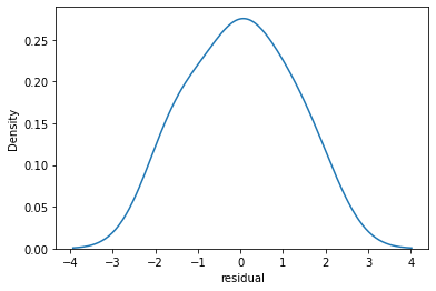
sns.scatterplot(data=quartet,x='y',y='residual')
plt.axhline(y=0, color='r', linestyle='--')<matplotlib.lines.Line2D at 0x21603641688>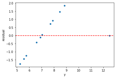
Plotting Residuals
It's also important to plot out residuals and check for normal distribution, this helps us understand if Linear Regression was a valid model choice.
# Predictions on training and testing sets
# Doing residuals separately will alert us to any issue with the split call
test_predictions = model.predict(X_test)
# If our model was perfect, these would all be zeros
test_res = y_test - test_predictionssns.scatterplot(x=y_test,y=test_res)
plt.axhline(y=0, color='r', linestyle='--')<matplotlib.lines.Line2D at 0x216036b5308>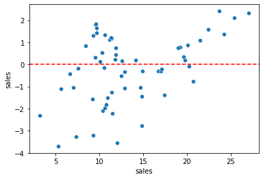
len(test_res)60sns.displot(test_res,bins=25,kde=True)<seaborn.axisgrid.FacetGrid at 0x2160370e708>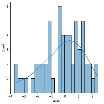
Still unsure if normality is a reasonable approximation? We can check against the normal probability plot. (opens in a new tab)
import scipy as sp# Create a figure and axis to plot on
fig, ax = plt.subplots(figsize=(6,8),dpi=100)
# probplot returns the raw values if needed
# we just want to see the plot, so we assign these values to _
_ = sp.stats.probplot(test_res,plot=ax)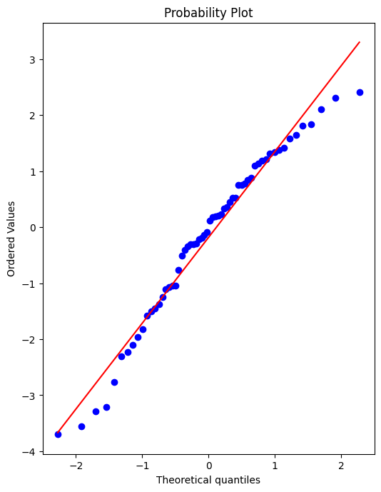
Retraining Model on Full Data
If we're satisfied with the performance on the test data, before deploying our model to the real world, we should retrain on all our data. (If we were not satisfied, we could update parameters or choose another model, something we'll discuss later on).
final_model = LinearRegression()final_model.fit(X,y)LinearRegression()Note how it may not really make sense to recalulate RMSE metrics here, since the model has already seen all the data, its not a fair judgement of performance to calculate RMSE on data its already seen, thus the purpose of the previous examination of test performance.
Deployment, Predictions, and Model Attributes
Final Model Fit
Note, we can only do this since we only have 3 features, for any more it becomes unreasonable.
y_hat = final_model.predict(X)fig,axes = plt.subplots(nrows=1,ncols=3,figsize=(16,6))
axes[0].plot(df['TV'],df['sales'],'o')
axes[0].plot(df['TV'],y_hat,'o',color='red')
axes[0].set_ylabel("Sales")
axes[0].set_title("TV Spend")
axes[1].plot(df['radio'],df['sales'],'o')
axes[1].plot(df['radio'],y_hat,'o',color='red')
axes[1].set_title("Radio Spend")
axes[1].set_ylabel("Sales")
axes[2].plot(df['newspaper'],df['sales'],'o')
axes[2].plot(df['radio'],y_hat,'o',color='red')
axes[2].set_title("Newspaper Spend");
axes[2].set_ylabel("Sales")
plt.tight_layout();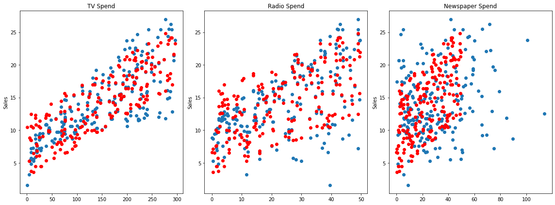
Residuals
Should be normally distributed as discussed in the video.
residuals = y_hat - ysns.scatterplot(x=y,y=residuals)
plt.axhline(y=0, color='r', linestyle='--')<matplotlib.lines.Line2D at 0x216039d7ac8>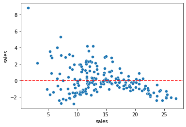
Coefficients
final_model.coef_array([ 0.04576465, 0.18853002, -0.00103749])coeff_df = pd.DataFrame(final_model.coef_,X.columns,columns=['Coefficient'])
coeff_dfCoefficient
TV
0.045765
radio
0.188530Interpreting the coefficients:
- Holding all other features fixed, a 1 unit (A thousand dollars) increase in TV Spend is associated with an increase in sales of 0.045 "sales units", in this case 1000s of units .
- This basically means that for every $1000 dollars spend on TV Ads, we could expect 45 more units sold.
- Holding all other features fixed, a 1 unit (A thousand dollars) increase in Radio Spend is associated with an increase in sales of 0.188 "sales units", in this case 1000s of units .
- This basically means that for every $1000 dollars spend on Radio Ads, we could expect 188 more units sold.
- Holding all other features fixed, a 1 unit (A thousand dollars) increase in Newspaper Spend is associated with a decrease in sales of 0.001 "sales units", in this case 1000s of units .
- This basically means that for every $1000 dollars spend on Newspaper Ads, we could actually expect to sell 1 less unit. Being so close to 0, this heavily implies that newspaper spend has no real effect on sales.
Note! In this case all our units were the same for each feature (1 unit = $1000 of ad spend). But in other datasets, units may not be the same, such as a housing dataset could try to predict a sale price with both a feature for number of bedrooms and a feature of total area like square footage. In this case it would make more sense to normalize the data, in order to clearly compare features and results. We will cover normalization later on.
df.corr()TV
radio
newspaper
sales
TVPrediction on New Data
Recall , X_test data set looks exactly the same as brand new data, so we simply need to call .predict() just as before to predict sales for a new advertising campaign.
Our next ad campaign will have a total spend of 149k on TV, 22k on Radio, and 12k on Newspaper Ads, how many units could we expect to sell as a result of this?
campaign = [[149,22,12]]final_model.predict(campaign)array([13.893032])How accurate is this prediction? No real way to know! We only know truly know our model's performance on the test data, that is why we had to be satisfied by it first, before training our full model
Model Persistence (Saving and Loading a Model)
from joblib import dump, loaddump(final_model, 'sales_model.joblib')['sales_model.joblib']loaded_model = load('sales_model.joblib')loaded_model.predict(campaign)array([13.893032])