 ++++
++++Notebook converted from Jupyter for blog publishing.
01-Sup-Learning-Capstone-Tree-Methods-SOLNs
Supervised Learning Capstone Project - Tree Methods Focus - SOLUTIONS
Make sure to review the introduction video to understand the 3 ways of approaching this project exercise!
Ways to approach the project:
- Open a new notebook, read in the data, and then analyze and visualize whatever you want, then create a predictive model.
- Use this notebook as a general guide, completing the tasks in bold shown below.
- Skip to the solutions notebook and video, and treat project at a more relaxing code along walkthrough lecture series.
GOAL: Create a model to predict whether or not a customer will Churn .
Complete the Tasks in Bold Below!
Part 0: Imports and Read in the Data
TASK: Run the filled out cells below to import libraries and read in your data. The data file is "Telco-Customer-Churn.csv"
# RUN THESE CELLS TO START THE PROJECT!
import numpy as np
import pandas as pd
import matplotlib.pyplot as plt
import seaborn as sns
df = pd.read_csv('../DATA/Telco-Customer-Churn.csv')df.head()customerID
gender
SeniorCitizen
Partner
DependentsPart 1: Quick Data Check
TASK: Confirm quickly with .info() methods the datatypes and non-null values in your dataframe.
# CODE HEREdf.info()<class 'pandas.core.frame.DataFrame'>
RangeIndex: 7032 entries, 0 to 7031
Data columns (total 21 columns):
# Column Non-Null Count Dtype
--- ------ -------------- ----- TASK: Get a quick statistical summary of the numeric columns with .describe() , you should notice that many columns are categorical, meaning you will eventually need to convert them to dummy variables.
# CODE HEREdf.describe()SeniorCitizen
tenure
MonthlyCharges
TotalCharges
countPart 2: Exploratory Data Analysis
General Feature Exploration
TASK: Confirm that there are no NaN cells by displaying NaN values per feature column.
# CODE HEREdf.isna().sum()customerID 0
gender 0
SeniorCitizen 0
Partner 0
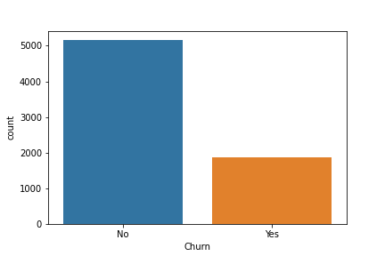
Dependents 0TASK:Display the balance of the class labels (Churn) with a Count Plot.
# CODE HEREsns.countplot(data=df,x='Churn')<AxesSubplot:xlabel='Churn', ylabel='count'>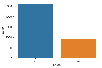
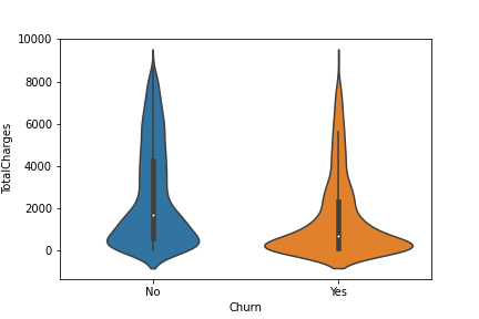
TASK: Explore the distrbution of TotalCharges between Churn categories with a Box Plot or Violin Plot.
# CODE HEREsns.violinplot(data=df,x='Churn',y='TotalCharges')<AxesSubplot:xlabel='Churn', ylabel='TotalCharges'>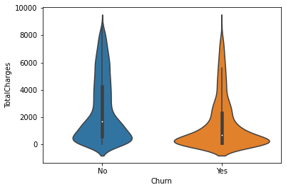
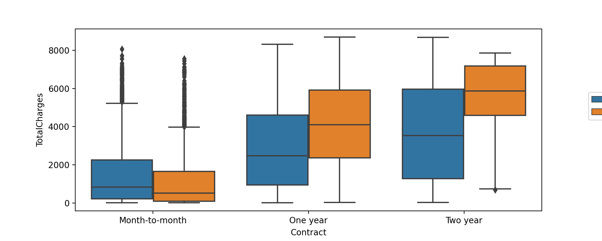
TASK: Create a boxplot showing the distribution of TotalCharges per Contract type, also add in a hue coloring based on the Churn class.
#CODE HEREplt.figure(figsize=(10,4),dpi=200)
sns.boxplot(data=df,y='TotalCharges',x='Contract',hue='Churn')
plt.legend(loc=(1.1,0.5))<matplotlib.legend.Legend at 0x2d1eb25c100>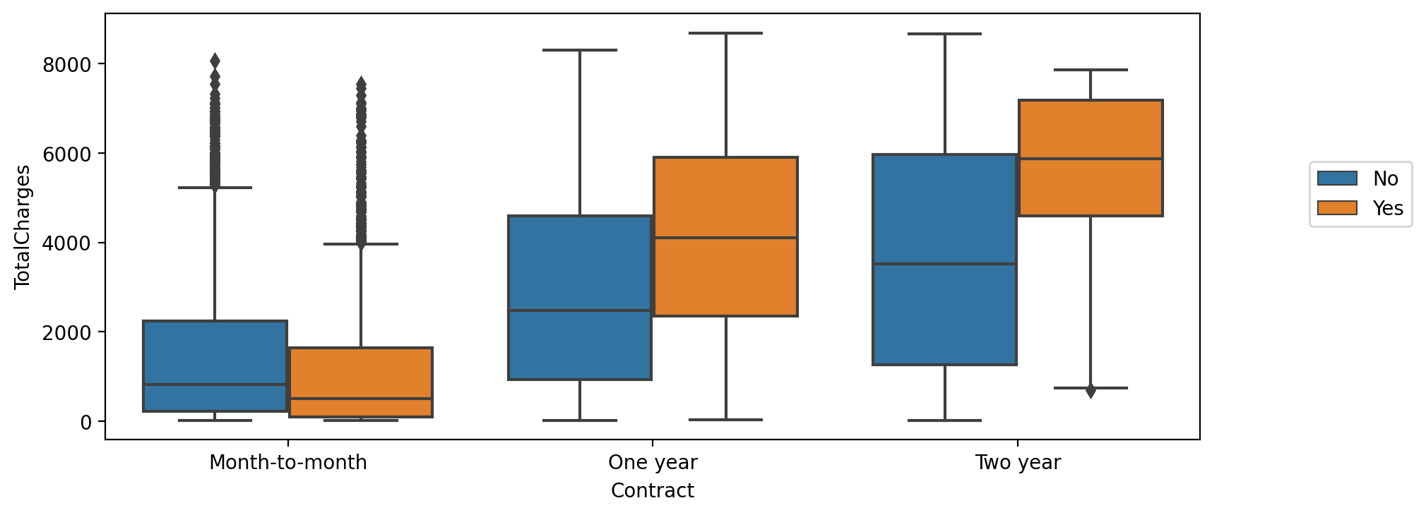
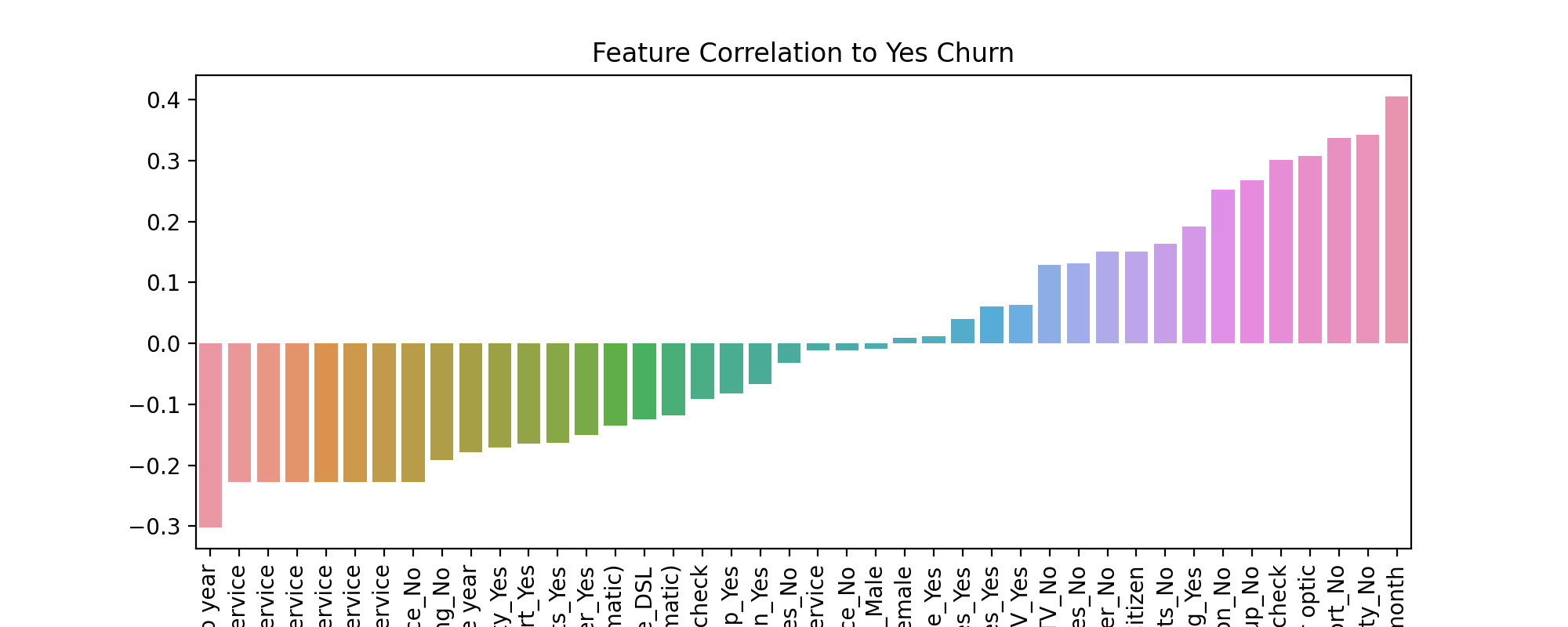
TASK: Create a bar plot showing the correlation of the following features to the class label. Keep in mind, for the categorical features, you will need to convert them into dummy variables first, as you can only calculate correlation for numeric features.
['gender', 'SeniorCitizen', 'Partner', 'Dependents','PhoneService', 'MultipleLines', 'OnlineSecurity', 'OnlineBackup', 'DeviceProtection', 'TechSupport', 'InternetService', 'StreamingTV', 'StreamingMovies', 'Contract', 'PaperlessBilling', 'PaymentMethod']
Note, we specifically listed only the features above, you should not check the correlation for every feature, as some features have too many unique instances for such an analysis, such as customerID
#CODE HEREdf.columnsIndex(['customerID', 'gender', 'SeniorCitizen', 'Partner', 'Dependents',
'tenure', 'PhoneService', 'MultipleLines', 'InternetService',
'OnlineSecurity', 'OnlineBackup', 'DeviceProtection', 'TechSupport',
'StreamingTV', 'StreamingMovies', 'Contract', 'PaperlessBilling',
'PaymentMethod', 'MonthlyCharges', 'TotalCharges', 'Churn'],corr_df = pd.get_dummies(df[['gender', 'SeniorCitizen', 'Partner', 'Dependents','PhoneService', 'MultipleLines', 'InternetService',
'OnlineSecurity', 'OnlineBackup', 'DeviceProtection', 'TechSupport','StreamingTV', 'StreamingMovies', 'Contract', 'PaperlessBilling',
'PaymentMethod','Churn']]).corr()corr_df['Churn_Yes'].sort_values().iloc[1:-1]Contract_Two year -0.301552
StreamingMovies_No internet service -0.227578
StreamingTV_No internet service -0.227578
TechSupport_No internet service -0.227578
DeviceProtection_No internet service -0.227578plt.figure(figsize=(10,4),dpi=200)
sns.barplot(x=corr_df['Churn_Yes'].sort_values().iloc[1:-1].index,y=corr_df['Churn_Yes'].sort_values().iloc[1:-1].values)
plt.title("Feature Correlation to Yes Churn")
plt.xticks(rotation=90);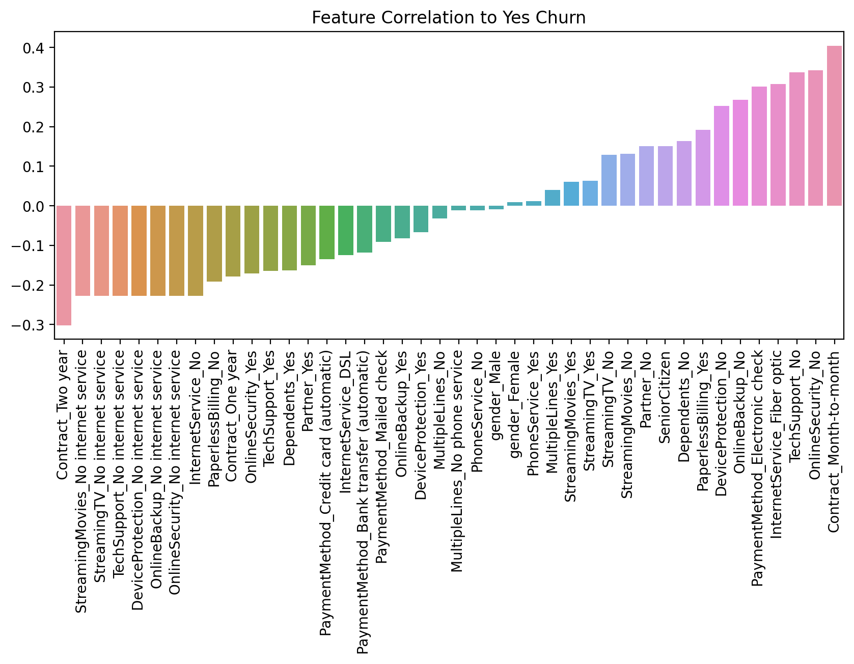
Part 3: Churn Analysis
This section focuses on segementing customers based on their tenure, creating "cohorts", allowing us to examine differences between customer cohort segments.
TASK: What are the 3 contract types available?
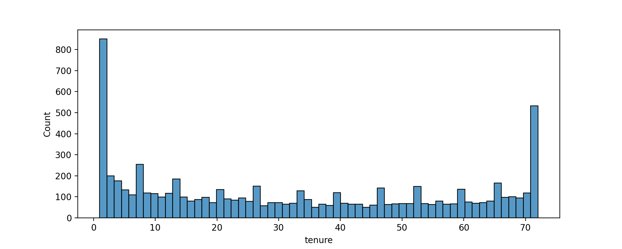
# CODE HEREdf['Contract'].unique()array(['Month-to-month', 'One year', 'Two year'], dtype=object)TASK: Create a histogram displaying the distribution of 'tenure' column, which is the amount of months a customer was or has been on a customer.
#CODE HEREplt.figure(figsize=(10,4),dpi=200)
sns.histplot(data=df,x='tenure',bins=60)<AxesSubplot:xlabel='tenure', ylabel='Count'>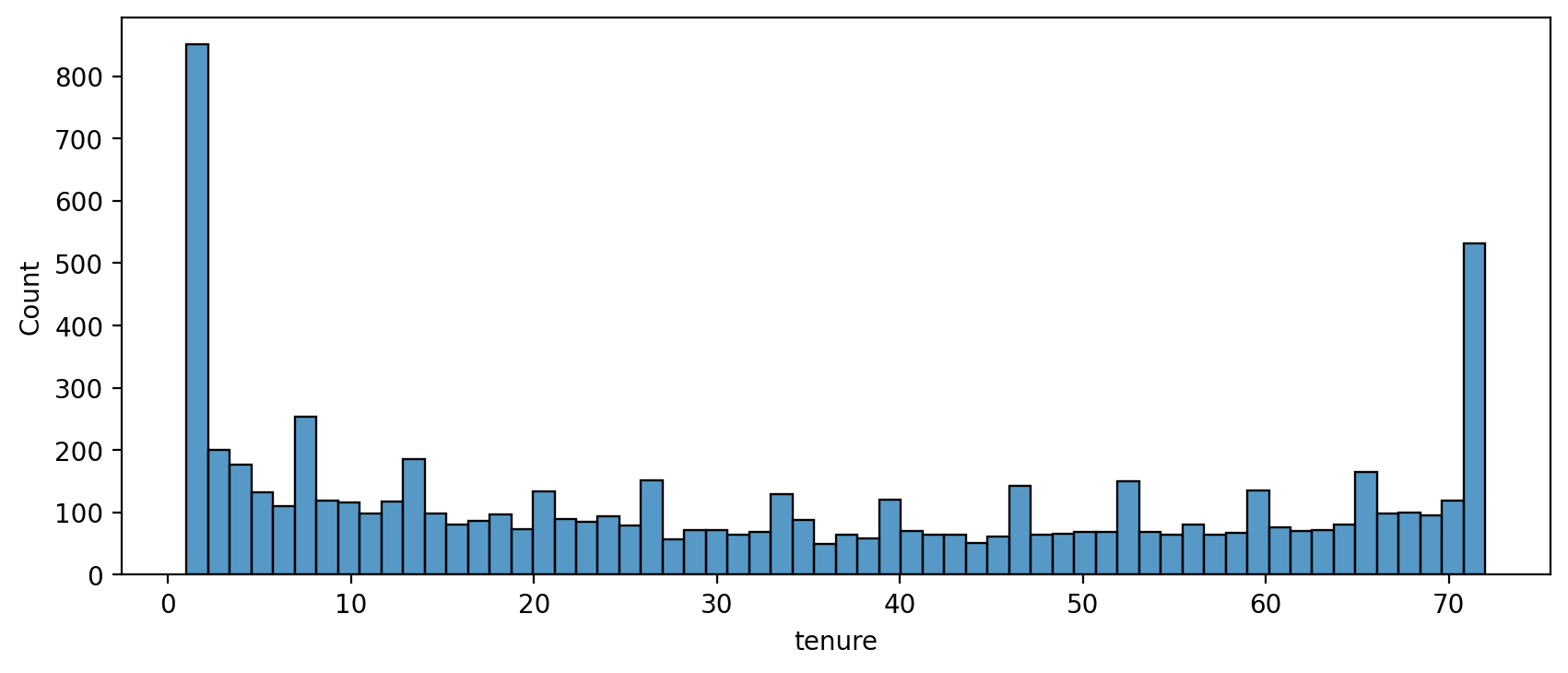
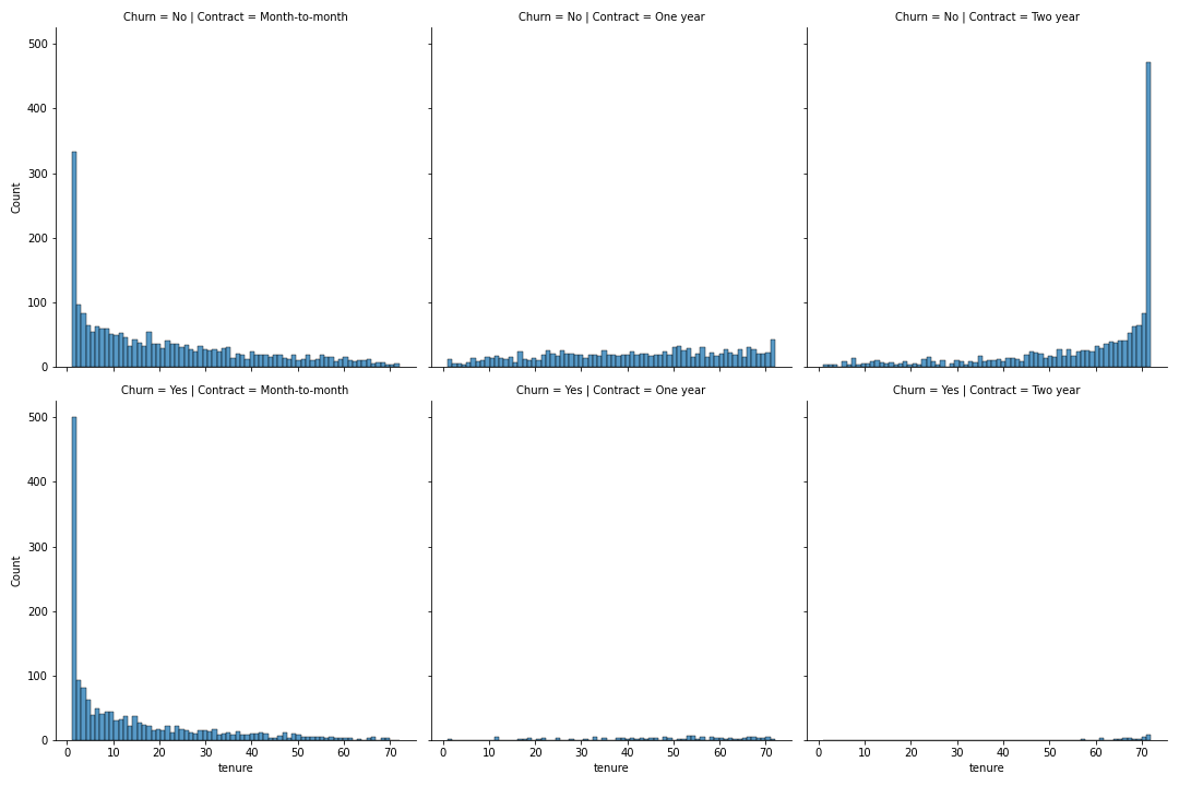
TASK: Now use the seaborn documentation as a guide to create histograms separated by two additional features, Churn and Contract.
#CODE HEREplt.figure(figsize=(10,3),dpi=200)
sns.displot(data=df,x='tenure',bins=70,col='Contract',row='Churn');<Figure size 2000x600 with 0 Axes>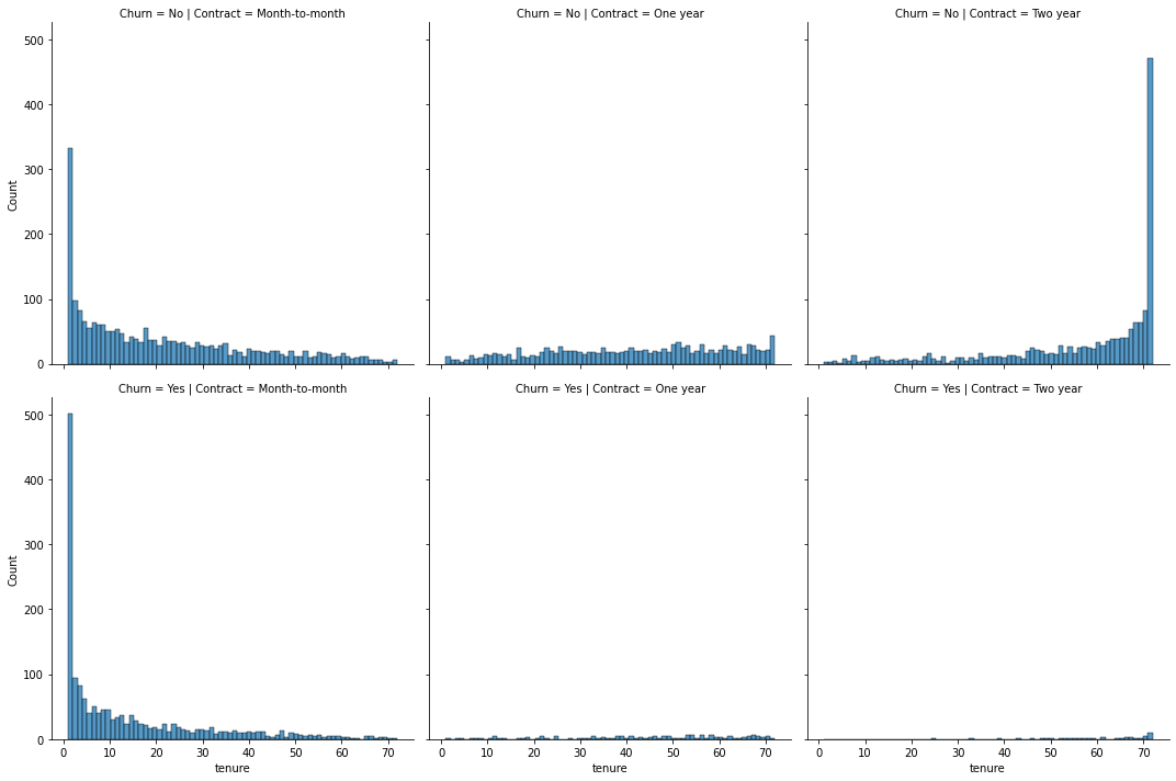
TASK: Display a scatter plot of Total Charges versus Monthly Charges, and color hue by Churn.
#CODE HEREdf.columnsIndex(['customerID', 'gender', 'SeniorCitizen', 'Partner', 'Dependents',
'tenure', 'PhoneService', 'MultipleLines', 'InternetService',
'OnlineSecurity', 'OnlineBackup', 'DeviceProtection', 'TechSupport',
'StreamingTV', 'StreamingMovies', 'Contract', 'PaperlessBilling',
'PaymentMethod', 'MonthlyCharges', 'TotalCharges', 'Churn'],plt.figure(figsize=(10,4),dpi=200)
sns.scatterplot(data=df,x='MonthlyCharges',y='TotalCharges',hue='Churn', linewidth=0.5,alpha=0.5,palette='Dark2')<AxesSubplot:xlabel='MonthlyCharges', ylabel='TotalCharges'>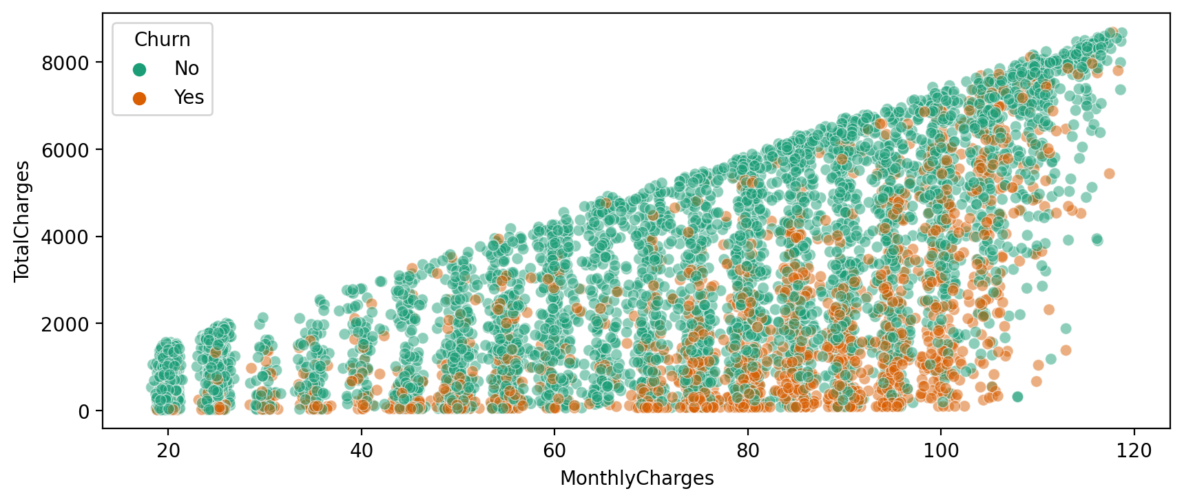
Creating Cohorts based on Tenure
Let's begin by treating each unique tenure length, 1 month, 2 month, 3 month...N months as its own cohort.
TASK: Treating each unique tenure group as a cohort, calculate the Churn rate (percentage that had Yes Churn) per cohort. For example, the cohort that has had a tenure of 1 month should have a Churn rate of 61.99%. You should have cohorts 1-72 months with a general trend of the longer the tenure of the cohort, the less of a churn rate. This makes sense as you are less likely to stop service the longer you've had it.
#CODE HEREno_churn = df.groupby(['Churn','tenure']).count().transpose()['No']
yes_churn = df.groupby(['Churn','tenure']).count().transpose()['Yes']churn_rate = 100 * yes_churn / (no_churn+yes_churn)churn_rate.transpose()['customerID']tenure
1 61.990212
2 51.680672
3 47.000000
4 47.159091TASK: Now that you have Churn Rate per tenure group 1-72 months, create a plot showing churn rate per months of tenure.
#CODE HEREplt.figure(figsize=(10,4),dpi=200)
churn_rate.iloc[0].plot()
plt.ylabel('Churn Percentage');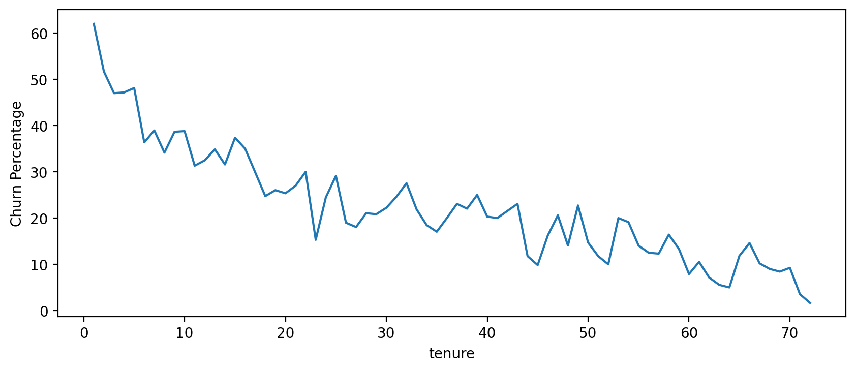
Broader Cohort Groups
TASK: Based on the tenure column values, create a new column called Tenure Cohort that creates 4 separate categories:
- '0-12 Months'
- '24-48 Months'
- '12-24 Months'
- 'Over 48 Months'
# CODE HEREdef cohort(tenure):
if tenure < 13:
return '0-12 Months'
elif tenure < 25:
return '12-24 Months'
elif tenure < 49:
return '24-48 Months'
else:
return "Over 48 Months"df['Tenure Cohort'] = df['tenure'].apply(cohort)df.head(10)[['tenure','Tenure Cohort']]tenure
Tenure Cohort
0
1
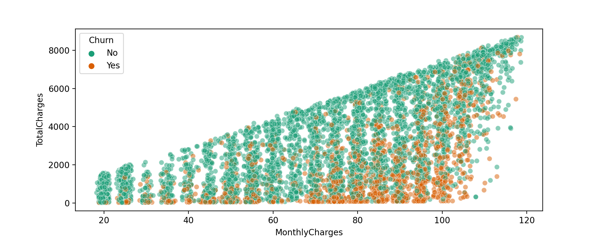
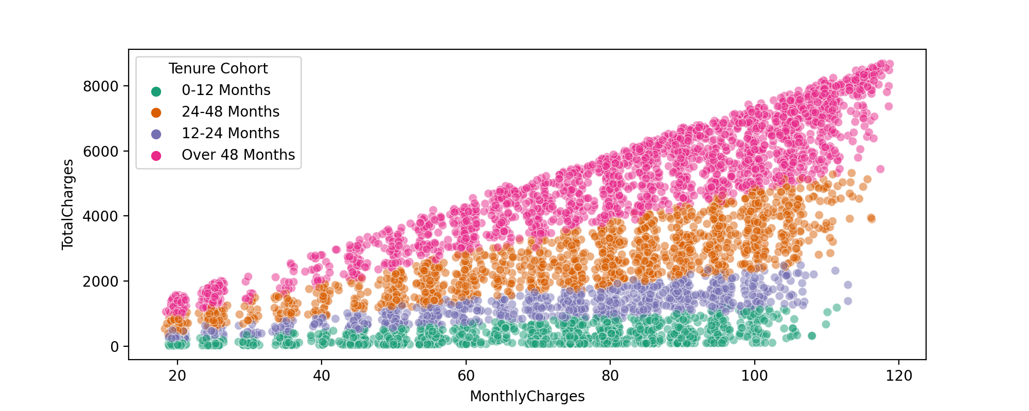
0-12 MonthsTASK: Create a scatterplot of Total Charges versus Monthly Charts,colored by Tenure Cohort defined in the previous task.
#CODE HEREplt.figure(figsize=(10,4),dpi=200)
sns.scatterplot(data=df,x='MonthlyCharges',y='TotalCharges',hue='Tenure Cohort', linewidth=0.5,alpha=0.5,palette='Dark2')<AxesSubplot:xlabel='MonthlyCharges', ylabel='TotalCharges'>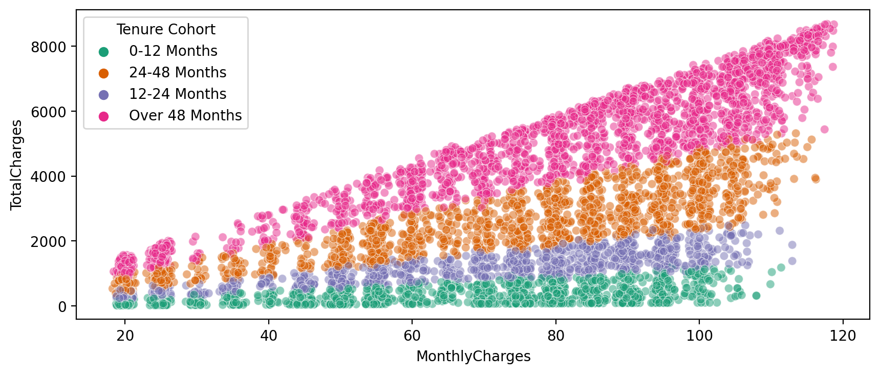
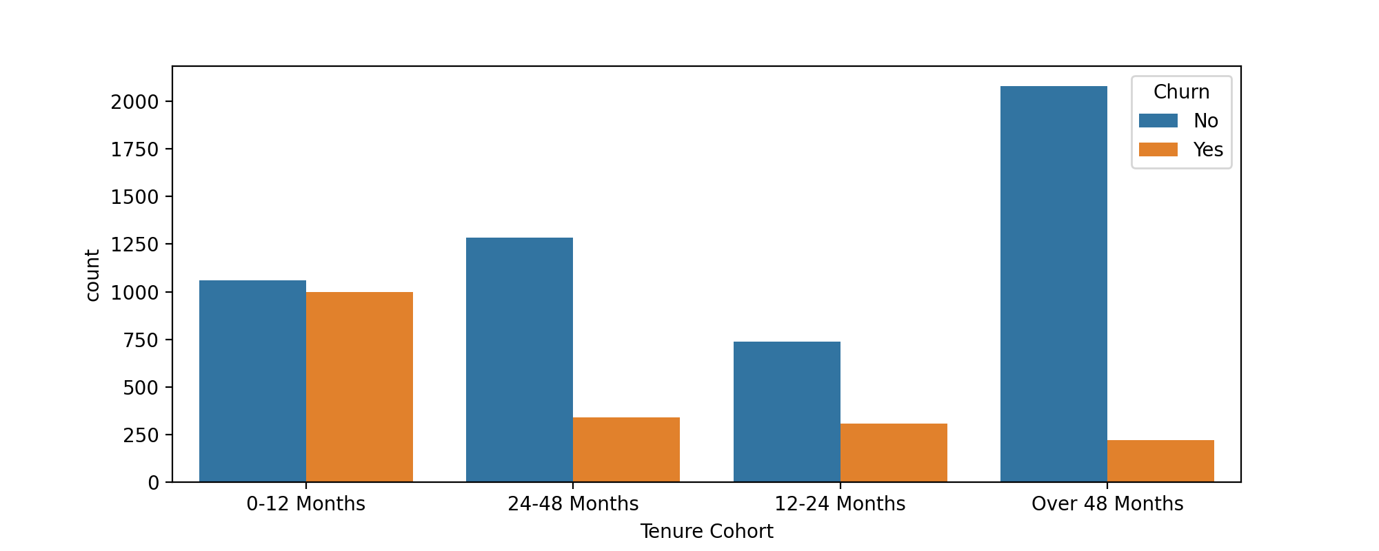
TASK: Create a count plot showing the churn count per cohort.
#CODE HEREplt.figure(figsize=(10,4),dpi=200)
sns.countplot(data=df,x='Tenure Cohort',hue='Churn')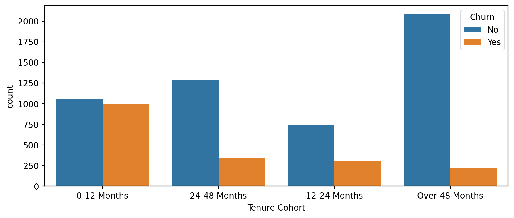
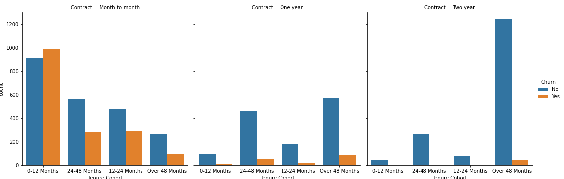
TASK: Create a grid of Count Plots showing counts per Tenure Cohort, separated out by contract type and colored by the Churn hue.
#CODE HEREplt.figure(figsize=(10,4),dpi=200)
sns.catplot(data=df,x='Tenure Cohort',hue='Churn',col='Contract',kind='count')<seaborn.axisgrid.FacetGrid at 0x2d1e3caafd0><Figure size 2000x800 with 0 Axes>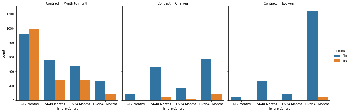
Part 4: Predictive Modeling
Let's explore 4 different tree based methods: A Single Decision Tree, Random Forest, AdaBoost, Gradient Boosting. Feel free to add any other supervised learning models to your comparisons!
Single Decision Tree
TASK : Separate out the data into X features and Y label. Create dummy variables where necessary and note which features are not useful and should be dropped.
#CODE HEREX = df.drop(['Churn','customerID'],axis=1)
X = pd.get_dummies(X,drop_first=True)y = df['Churn']TASK: Perform a train test split, holding out 10% of the data for testing. We'll use a random_state of 101 in the solutions notebook/video.
#CODE HEREfrom sklearn.model_selection import train_test_splitX_train, X_test, y_train, y_test = train_test_split(X, y, test_size=0.1, random_state=101)TASK: Decision Tree Perfomance. Complete the following tasks:
- Train a single decision tree model (feel free to grid search for optimal hyperparameters).
- Evaluate performance metrics from decision tree, including classification report and plotting a confusion matrix.
- Calculate feature importances from the decision tree.
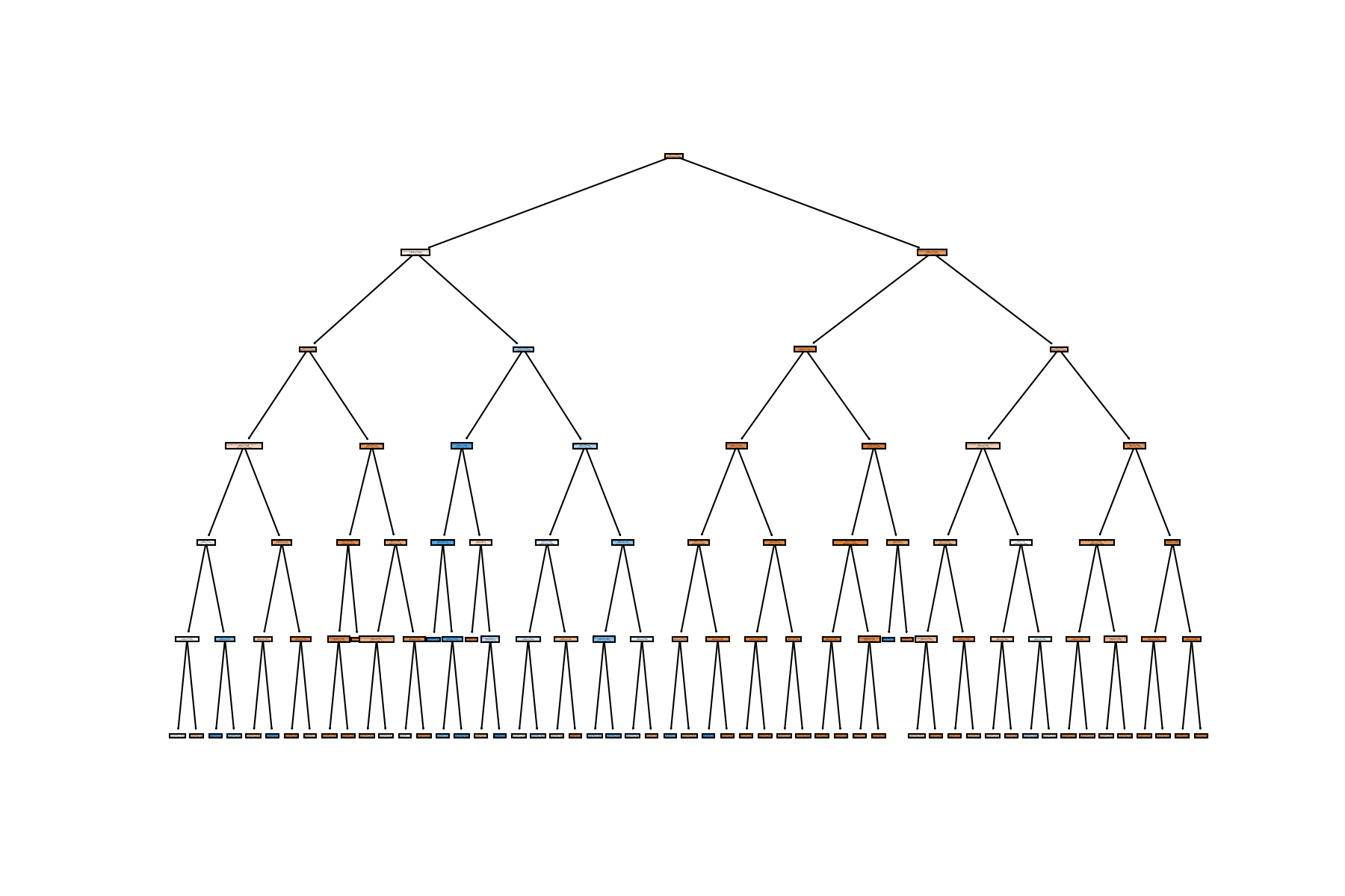
- OPTIONAL: Plot your tree, note, the tree could be huge depending on your pruning, so it may crash your notebook if you display it with plot_tree.
from sklearn.tree import DecisionTreeClassifierdt = DecisionTreeClassifier(max_depth=6)dt.fit(X_train,y_train)DecisionTreeClassifier(max_depth=6)preds = dt.predict(X_test)from sklearn.metrics import accuracy_score,plot_confusion_matrix,classification_reportprint(classification_report(y_test,preds)) precision recall f1-score support
No 0.87 0.89 0.88 557
Yes 0.55 0.49 0.52 147
plot_confusion_matrix(dt,X_test,y_test)<sklearn.metrics._plot.confusion_matrix.ConfusionMatrixDisplay at 0x2d1e9601d90>
imp_feats = pd.DataFrame(data=dt.feature_importances_,index=X.columns,columns=['Feature Importance']).sort_values("Feature Importance")plt.figure(figsize=(14,6),dpi=200)
sns.barplot(data=imp_feats.sort_values('Feature Importance'),x=imp_feats.sort_values('Feature Importance').index,y='Feature Importance')
plt.xticks(rotation=90)
plt.title("Feature Importance for Decision Tree");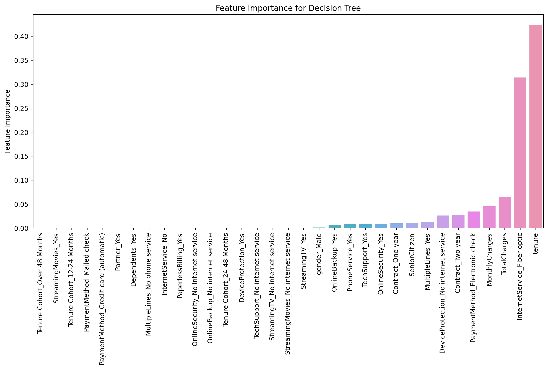
from sklearn.tree import plot_treeplt.figure(figsize=(12,8),dpi=150)
plot_tree(dt,filled=True,feature_names=X.columns);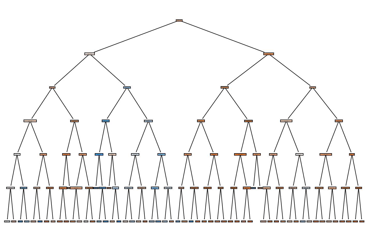
Random Forest
TASK: Create a Random Forest model and create a classification report and confusion matrix from its predicted results on the test set.
#CODE HEREfrom sklearn.ensemble import RandomForestClassifierrf = RandomForestClassifier(n_estimators=100)rf.fit(X_train,y_train)RandomForestClassifier()preds = rf.predict(X_test)print(classification_report(y_test,preds)) precision recall f1-score support
No 0.86 0.89 0.87 557
Yes 0.52 0.44 0.48 147
plot_confusion_matrix(dt,X_test,y_test)<sklearn.metrics._plot.confusion_matrix.ConfusionMatrixDisplay at 0x2d1e6a54040>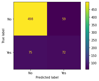
Boosted Trees
TASK: Use AdaBoost or Gradient Boosting to create a model and report back the classification report and plot a confusion matrix for its predicted results
#CODE HEREfrom sklearn.ensemble import GradientBoostingClassifier,AdaBoostClassifierada_model = AdaBoostClassifier()ada_model.fit(X_train,y_train)AdaBoostClassifier()preds = ada_model.predict(X_test)print(classification_report(y_test,preds)) precision recall f1-score support
No 0.88 0.90 0.89 557
Yes 0.60 0.54 0.57 147
plot_confusion_matrix(dt,X_test,y_test)<sklearn.metrics._plot.confusion_matrix.ConfusionMatrixDisplay at 0x2d1e9373a30>
TASK: Analyze your results, which model performed best for you?
# With base models, we got best performance from an AdaBoostClassifier, but note, we didn't do any gridsearching AND most models performed about the same on the data set.