 ++++
++++Data Science
May 2026×Notebook lesson
Notebook converted from Jupyter for blog publishing.
05-Seaborn-Grids
Driptanil DattaSoftware Developer
Grids
Imports
import numpy as np
import pandas as pd
import matplotlib.pyplot as plt
import seaborn as sns
The Data
df = pd.read_csv('StudentsPerformance.csv')df.head()HTML
MORE
gender
race/ethnicity
parental level of education
lunch
test preparation course
catplot()
# Kind Options are: “point”, “bar”, “strip”, “swarm”, “box”, “violin”, or “boxen”
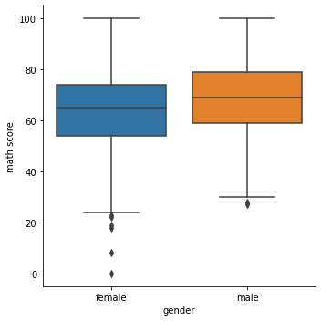
sns.catplot(x='gender',y='math score',data=df,kind='box')RESULT
<seaborn.axisgrid.FacetGrid at 0x1e24e235b08>PLOT
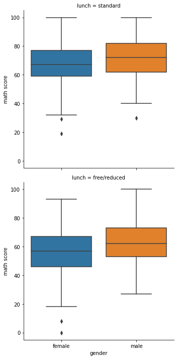
sns.catplot(x='gender',y='math score',data=df,kind='box',row='lunch')RESULT
<seaborn.axisgrid.FacetGrid at 0x1e24e37b2c8>PLOT
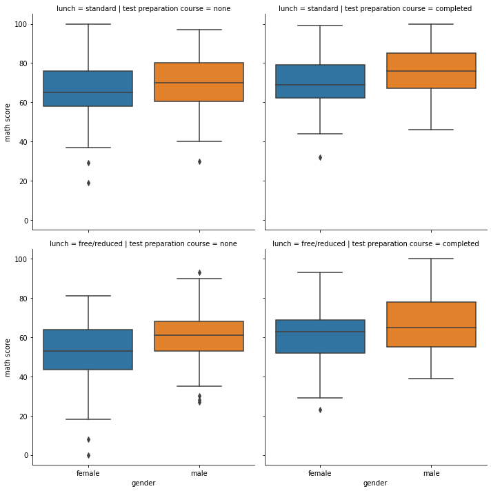
sns.catplot(x='gender',y='math score',data=df,kind='box',row='lunch',col='test preparation course')RESULT
<seaborn.axisgrid.FacetGrid at 0x1e24e856388>PLOT
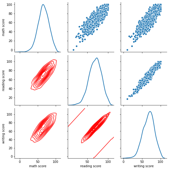
Pairgrid
Grid that pairplot is built on top of, allows for heavy customization of the pairplot seen earlier.
g = sns.PairGrid(df)
g = g.map_upper(sns.scatterplot)
g = g.map_diag(sns.kdeplot, lw=2)
g = g.map_lower(sns.kdeplot, colors="red")
PLOT
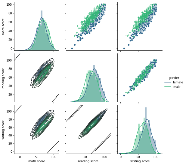
g = sns.PairGrid(df, hue="gender", palette="viridis",hue_kws={"marker": ["o", "+"]})
g = g.map_upper(sns.scatterplot, linewidths=1, edgecolor="w", s=40)
g = g.map_diag(sns.distplot)
g = g.map_lower(sns.kdeplot)
g = g.add_legend();

# Safely ignore the warning, its telling you it didn't use the marker for kde plot
STDERR
c:\users\marcial\anaconda3\envs\ml_master\lib\site-packages\seaborn\distributions.py:434: UserWarning: The following kwargs were not used by contour: 'marker'
  cset = contour_func(xx, yy, z, n_levels, **kwargs)
PLOT
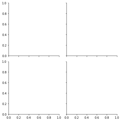
FacetGrid
sns.FacetGrid(data=df,col='gender',row='lunch')RESULT
<seaborn.axisgrid.FacetGrid at 0x1e24be00748>PLOT
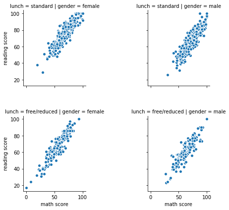
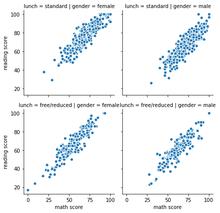
g = sns.FacetGrid(data=df,col='gender',row='lunch')
g = g.map(plt.scatter, "math score", "reading score", edgecolor="w")
g.add_legend()
RESULT
<seaborn.axisgrid.FacetGrid at 0x1e24f4fcb08>PLOT
# https://stackoverflow.com/questions/43669229/increase-space-between-rows-on-facetgrid-plotg = sns.FacetGrid(data=df,col='gender',row='lunch')
g = g.map(plt.scatter, "math score", "reading score", edgecolor="w")
g.add_legend()
plt.subplots_adjust(hspace=0.4, wspace=1)PLOT