 ++++
++++Data Science
May 2026×Notebook lesson
Notebook converted from Jupyter for blog publishing.
06-Matrix-Plots
Driptanil DattaSoftware Developer
Matrix Plots
NOTE: Make sure to watch the video lecture, not all datasets are well suited for a heatmap or clustermap.
Imports
import numpy as np
import pandas as pd
import matplotlib.pyplot as plt
import seaborn as sns
The Data
World Population Prospects publishes United Nations population estimates for all world countries and every year from 1950 to 2020, as well as projections for different scenarios (low, middle and high variants) from 2020 to 2100. The figures presented here correspond to middle variant projections for the given year.
Source : Estimates for the current year based on data from the World Population Prospects. United Nations.
# 2020 Projections
df = pd.read_csv('country_table.csv')dfHTML
MORE
Countries
Birth rate
Mortality rate
Life expectancy
Infant mortality rate
Heatmap
df = df.set_index('Countries')dfHTML
MORE
Birth rate
Mortality rate
Life expectancy
Infant mortality rate
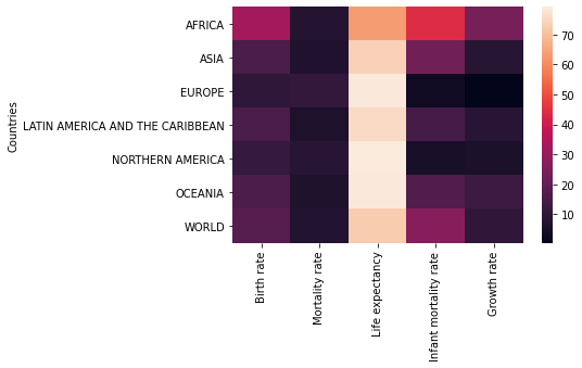
Growth rate# Clearly shows life expectancy in different units
sns.heatmap(df)RESULT
<AxesSubplot:ylabel='Countries'>PLOT
rates = df.drop('Life expectancy',axis=1)sns.heatmap(rates)RESULT
<AxesSubplot:ylabel='Countries'>PLOT
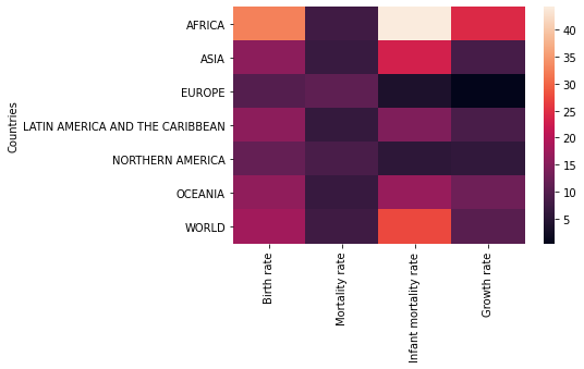
sns.heatmap(rates,linewidth=0.5)RESULT
<AxesSubplot:ylabel='Countries'>PLOT

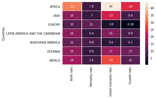
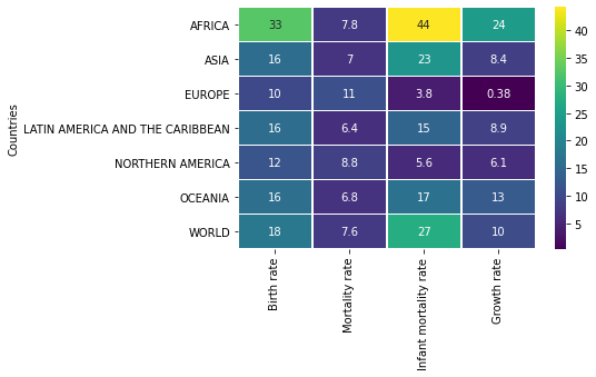
sns.heatmap(rates,linewidth=0.5,annot=True)RESULT
<AxesSubplot:ylabel='Countries'>PLOT
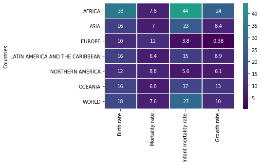
# Note how its not palette here
sns.heatmap(rates,linewidth=0.5,annot=True,cmap='viridis')
RESULT
<AxesSubplot:ylabel='Countries'>PLOT
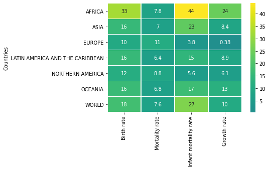
# Set colorbar based on value from dataset
sns.heatmap(rates,linewidth=0.5,annot=True,cmap='viridis',center=40)
RESULT
<AxesSubplot:ylabel='Countries'>PLOT
# Set colorbar based on value from dataset
sns.heatmap(rates,linewidth=0.5,annot=True,cmap='viridis',center=1)
RESULT
<AxesSubplot:ylabel='Countries'>PLOT
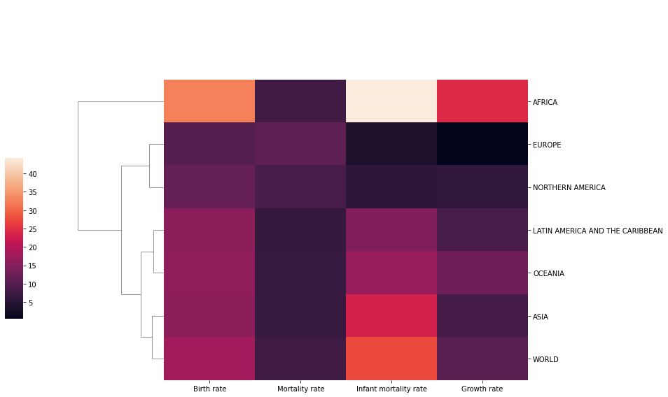
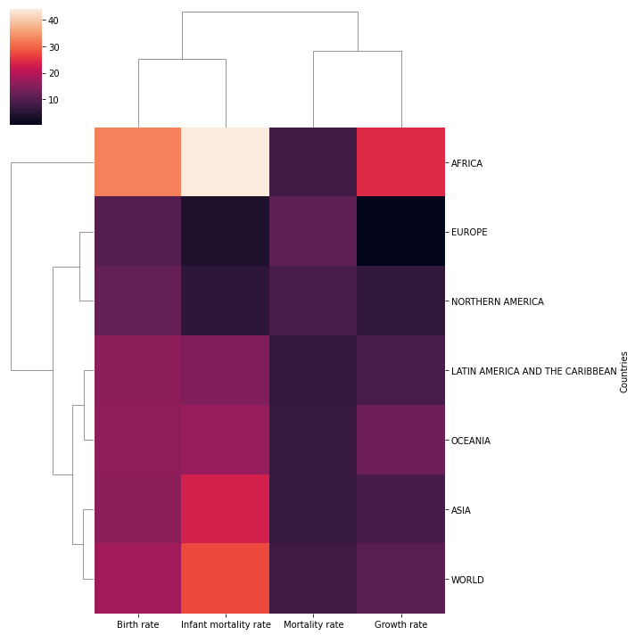
Clustermap
Plot a matrix dataset as a hierarchically-clustered heatmap.
sns.clustermap(rates)RESULT
<seaborn.matrix.ClusterGrid at 0x158e27976c8>PLOT
sns.clustermap(rates,col_cluster=False)RESULT
<seaborn.matrix.ClusterGrid at 0x158e235c9c8>PLOT
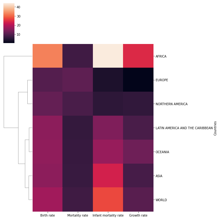
sns.clustermap(rates,col_cluster=False,figsize=(12,8),cbar_pos=(-0.1, .2, .03, .4))RESULT
<seaborn.matrix.ClusterGrid at 0x158e2ffc848>PLOT
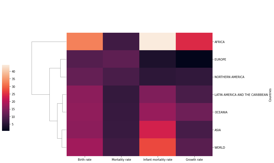
rates.index.set_names('',inplace=True)ratesHTML
MORE
Birth rate
Mortality rate
Infant mortality rate
Growth rate
AFRICA
# Recall you can always edit the DF before seaborn
sns.clustermap(rates,col_cluster=False,figsize=(12,8),cbar_pos=(-0.1, .2, .03, .4))RESULT
<seaborn.matrix.ClusterGrid at 0x158e354b508>PLOT