 ++++
++++Notebook converted from Jupyter for blog publishing.
03-Matplotlib-Styling-Plots
Import the matplotlib.pyplot{:python} module under the name plt{:python} (the tidy way):
# COMMON MISTAKE!
# DON'T FORGET THE .PYPLOT part

import matplotlib.pyplot as plt
NOTE: For users running .py scripts in an IDE like PyCharm or Sublime Text Editor. You will not see the plots in a notebook, instead if you are using another editor, you'll use: plt.show() at the end of all your plotting commands to have the figure pop up in another window.
The Data
import numpy as npx = np.arange(0,10)
y = 2 * xLegends
You can use the label="label text" keyword argument when plots or other objects are added to the figure, and then using the legend method without arguments to add the legend to the figure:
fig = plt.figure()

ax = fig.add_axes([0,0,1,1])

ax.plot(x, x**2, label="x**2")
ax.plot(x, x**3, label="x**3")
ax.legend()<matplotlib.legend.Legend at 0x151b84e0c08>
Notice how legend could potentially overlap some of the actual plot!
The legend function takes an optional keyword argument loc that can be used to specify where in the figure the legend is to be drawn. The allowed values of loc are numerical codes for the various places the legend can be drawn. See the documentation page (opens in a new tab) for details. Some of the most common loc values are:
# Lots of options....

ax.legend(loc=1) # upper right corner
ax.legend(loc=2) # upper left corner
ax.legend(loc=3) # lower left corner
ax.legend(loc=4) # lower right corner

# .. many more options are available

# Most common to choose
ax.legend(loc=0) # let matplotlib decide the optimal location
fig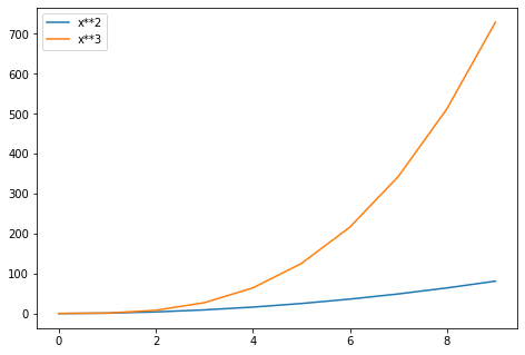
ax.legend(loc=(1.1,0.5)) # manually set location
fig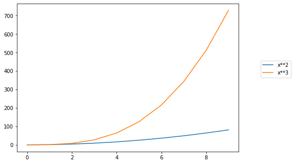
Setting colors, linewidths, linetypes
Matplotlib gives you a lot of options for customizing colors, linewidths, and linetypes.
There is the basic MATLAB like syntax (which I would suggest you avoid using unless you already feel really comfortable with MATLAB). Instead let's focus on the keyword parameters.
Quick View:
Colors with MatLab like syntax
With matplotlib, we can define the colors of lines and other graphical elements in a number of ways. First of all, we can use the MATLAB-like syntax where 'b'{:python} means blue, 'g'{:python} means green, etc. The MATLAB API for selecting line styles are also supported: where, for example, 'b.-' means a blue line with dots:
# MATLAB style line color and style
fig, ax = plt.subplots()
ax.plot(x, x**2, 'b.-') # blue line with dots
ax.plot(x, x**3, 'g--') # green dashed line[<matplotlib.lines.Line2D at 0x151b8c263c8>]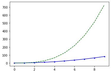
Suggested Approach: Use keyword arguments
Colors with the color parameter
We can also define colors by their names or RGB hex codes and optionally provide an alpha value using the color{:python} and alpha{:python} keyword arguments. Alpha indicates opacity.
fig, ax = plt.subplots()

ax.plot(x, x+1, color="blue", alpha=0.5) # half-transparant
ax.plot(x, x+2, color="#8B008B")        # RGB hex code
ax.plot(x, x+3, color="#FF8C00") # RGB hex code[<matplotlib.lines.Line2D at 0x151b8c7fa08>]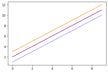
Line and marker styles
Linewidth
To change the line width, we can use the linewidth{:python} or lw{:python} keyword argument.
fig, ax = plt.subplots(figsize=(12,6))

# Use linewidth or lw
ax.plot(x, x-1, color="red", linewidth=0.25)
ax.plot(x, x-2, color="red", lw=0.50)
ax.plot(x, x-3, color="red", lw=1)
ax.plot(x, x-4, color="red", lw=10)[<matplotlib.lines.Line2D at 0x151b6dda608>]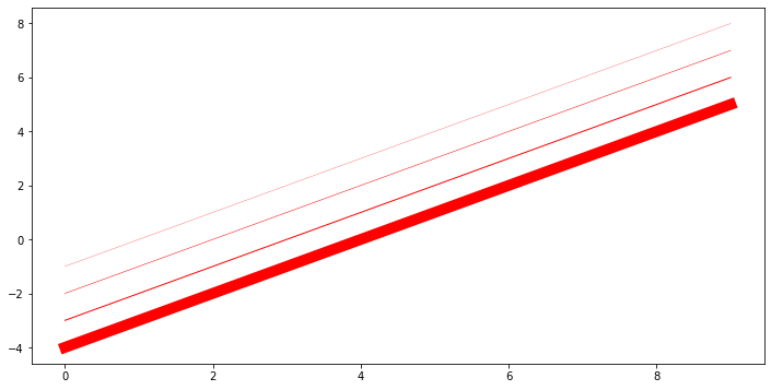
Linestyles
There are many linestyles to choose from, here is the selection:
# possible linestype options ‘--‘, ‘–’, ‘-.’, ‘:’, ‘steps’
fig, ax = plt.subplots(figsize=(12,6))

ax.plot(x, x-1, color="green", lw=3, linestyle='-') # solid
ax.plot(x, x-2, color="green", lw=3, ls='-.') # dash and dot
ax.plot(x, x-3, color="green", lw=3, ls=':') # dots
ax.plot(x, x-4, color="green", lw=3, ls='--') # dashes[<matplotlib.lines.Line2D at 0x151b6df5d48>]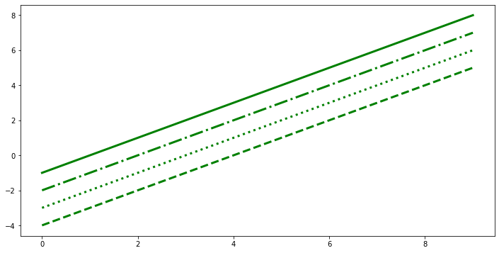
Custom linestyle dash
The dash sequence is a sequence of floats of even length describing the length of dashes and spaces in points.
For example, (5, 2, 1, 2) describes a sequence of 5 point and 1 point dashes separated by 2 point spaces.
First, we see we can actually "grab" the line from the .plot() command
fig, ax = plt.subplots(figsize=(12,6))

lines = ax.plot(x,x)

print(type(lines))<class 'list'>
fig, ax = plt.subplots(figsize=(12,6))
# custom dash
lines = ax.plot(x, x+8, color="black", lw=5)
lines[0].set_dashes([10, 10]) # format: line length, space length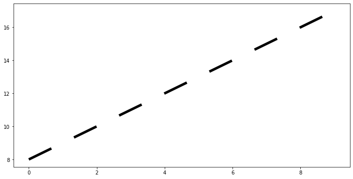
fig, ax = plt.subplots(figsize=(12,6))
# custom dash
lines = ax.plot(x, x+8, color="black", lw=5)
lines[0].set_dashes([1, 1,1,1,10,10]) # format: line length, space length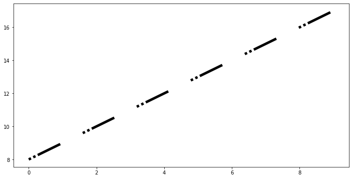
Markers
We've technically always been plotting points, and matplotlib has been automatically drawing a line between these points for us. Let's explore how to place markers at each of these points.
Markers Style
Huge list of marker types can be found here: https://matplotlib.org/3.2.2/api/markers_api.html (opens in a new tab)
fig, ax = plt.subplots(figsize=(12,6))

# Use marker for string code
# Use markersize or ms for size

ax.plot(x, x-1,marker='+',markersize=20)
ax.plot(x, x-2,marker='o',ms=20) #ms can be used for markersize
ax.plot(x, x-3,marker='s',ms=20,lw=0) # make linewidth zero to see only markers
ax.plot(x, x-4,marker='1',ms=20)[<matplotlib.lines.Line2D at 0x151b89eed08>]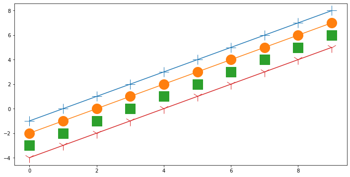
Custom marker edges, thickness,size,and style
fig, ax = plt.subplots(figsize=(12,6))

# marker size and color
ax.plot(x, x, color="black", lw=1, ls='-', marker='s', markersize=20,
        markerfacecolor="red", markeredgewidth=8, markeredgecolor="blue");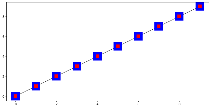
Final Thoughts
After these 4 notebooks on Matplotlib, you should feel comfortable creating simple quick plots, more advanced Figure plots and subplots, as well as styling them to your liking. You may have noticed we didn't cover statistical plots yet, like histograms or scatterplots, we will use the seaborn library to create those plots instead. Matplotlib is capable of creating those plots, but seaborn is easier to use (and built on top of matplotlib!).
We have an additional notebook called "Additional-Matplotlib-Commands" which you can explore for other concepts, mainly as a quick reference. We also highly encourage you to always do a quick Google Search and StackOverflow search for matplotlib questions, as there are thousands of already answered questions there and almost any quick matplotlib question already has an answer there.