 ++++
++++Notebook converted from Jupyter for blog publishing.
03-Logistic-Regression-Project-Exercise-Solution
Logistic Regression Project Exercise - Solutions
GOAL: Create a Classification Model that can predict whether or not a person has presence of heart disease based on physical features of that person (age,sex, cholesterol, etc...)
Complete the TASKs written in bold below.
Imports
TASK: Run the cell below to import the necessary libraries.
import numpy as np
import pandas as pd
import seaborn as sns
import matplotlib.pyplot as plt
Data
This database contains 14 physical attributes based on physical testing of a patient. Blood samples are taken and the patient also conducts a brief exercise test. The "goal" field refers to the presence of heart disease in the patient. It is integer (0 for no presence, 1 for presence). In general, to confirm 100% if a patient has heart disease can be quite an invasive process, so if we can create a model that accurately predicts the likelihood of heart disease, we can help avoid expensive and invasive procedures.
Content
Attribute Information:
- age
- sex
- chest pain type (4 values)
- resting blood pressure
- serum cholestoral in mg/dl
- fasting blood sugar > 120 mg/dl
- resting electrocardiographic results (values 0,1,2)
- maximum heart rate achieved
- exercise induced angina
- oldpeak = ST depression induced by exercise relative to rest
- the slope of the peak exercise ST segment
- number of major vessels (0-3) colored by flourosopy
- thal: 3 = normal; 6 = fixed defect; 7 = reversable defect
- target:0 for no presence of heart disease, 1 for presence of heart disease
Original Source: https://archive.ics.uci.edu/ml/datasets/Heart+Disease (opens in a new tab)
Creators:
Hungarian Institute of Cardiology. Budapest: Andras Janosi, M.D. University Hospital, Zurich, Switzerland: William Steinbrunn, M.D. University Hospital, Basel, Switzerland: Matthias Pfisterer, M.D. V.A. Medical Center, Long Beach and Cleveland Clinic Foundation: Robert Detrano, M.D., Ph.D.
TASK: Run the cell below to read in the data.
df = pd.read_csv('../DATA/heart.csv')df.head()age
sex
cp
trestbps
choldf['target'].unique()array([1, 0], dtype=int64)Exploratory Data Analysis and Visualization
Feel free to explore the data further on your own.
TASK: Explore if the dataset has any missing data points and create a statistical summary of the numerical features as shown below.
# CODE HEREdf.info()<class 'pandas.core.frame.DataFrame'>
RangeIndex: 303 entries, 0 to 302
Data columns (total 14 columns):
# Column Non-Null Count Dtype
--- ------ -------------- ----- # CODE HEREdf.describe().transpose()count
mean
std
min
25%Visualization Tasks
TASK: Create a bar plot that shows the total counts per target value.
# CODE HERE!sns.countplot(x='target',data=df)<AxesSubplot:xlabel='target', ylabel='count'>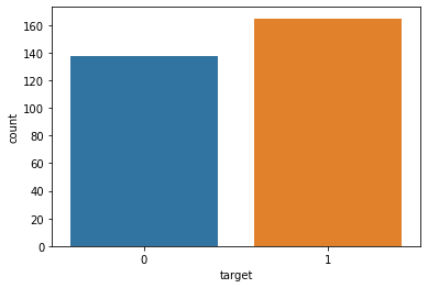
TASK: Create a pairplot that displays the relationships between the following columns:
['age','trestbps', 'chol','thalach','target']
Note: Running a pairplot on everything can take a very long time due to the number of features
# CODE HEREdf.columnsIndex(['age', 'sex', 'cp', 'trestbps', 'chol', 'fbs', 'restecg', 'thalach',
'exang', 'oldpeak', 'slope', 'ca', 'thal', 'target'],
dtype='object')# Running pairplot on everything will take a very long time to render!
sns.pairplot(df[['age','trestbps', 'chol','thalach','target']],hue='target')<seaborn.axisgrid.PairGrid at 0x2573c4e2148>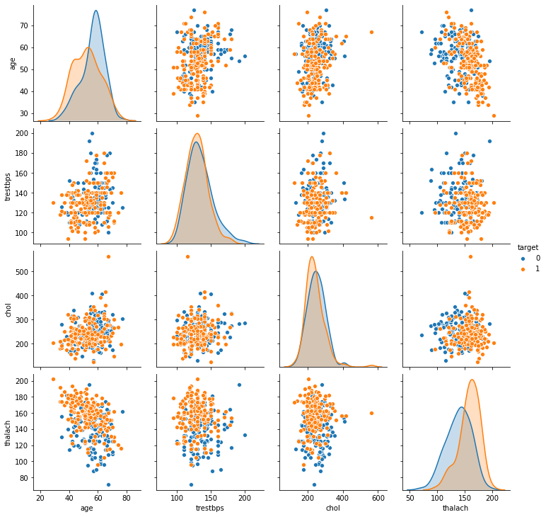
TASK: Create a heatmap that displays the correlation between all the columns.
# CODE HEREplt.figure(figsize=(12,8))
sns.heatmap(df.corr(),cmap='viridis',annot=True)<AxesSubplot:>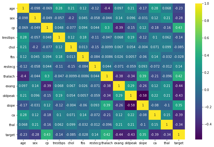
Machine Learning
Train | Test Split and Scaling
TASK: Separate the features from the labels into 2 objects, X and y.
# CODE HEREX = df.drop('target',axis=1)
y = df['target']TASK: Perform a train test split on the data, with the test size of 10% and a random_state of 101.
# CODE HEREfrom sklearn.model_selection import train_test_split
from sklearn.preprocessing import StandardScalerX_train, X_test, y_train, y_test = train_test_split(X, y, test_size=0.1, random_state=101)TASK: Create a StandardScaler object and normalize the X train and test set feature data. Make sure you only fit to the training data to avoid data leakage (data knowledge leaking from the test set).
# CODE HEREscaler = StandardScaler()scaled_X_train = scaler.fit_transform(X_train)
scaled_X_test = scaler.transform(X_test)Logistic Regression Model
TASK: Create a Logistic Regression model and use Cross-Validation to find a well-performing C value for the hyper-parameter search. You have two options here, use LogisticRegressionCV OR use a combination of LogisticRegression and GridSearchCV. The choice is up to you, the solutions use the simpler LogisticRegressionCV approach.
# CODE HEREfrom sklearn.linear_model import LogisticRegressionCV# help(LogisticRegressionCV)log_model = LogisticRegressionCV()log_model.fit(scaled_X_train,y_train)LogisticRegressionCV()TASK: Report back your search's optimal parameters, specifically the C value.
Note: You may get a different value than what is shown here depending on how you conducted your search.
# CODE HERElog_model.C_array([0.04641589])log_model.get_params(){'Cs': 10,
'class_weight': None,
'cv': None,
'dual': False,
'fit_intercept': True,Coeffecients
TASK: Report back the model's coefficients.
log_model.coef_array([[-0.09621199, -0.39460154, 0.53534731, -0.13850191, -0.08830462,
0.02487341, 0.08083826, 0.29914053, -0.33438151, -0.352386 ,
0.25101033, -0.49735752, -0.37448551]])BONUS TASK: We didn't show this in the lecture notebooks, but you have the skills to do this! Create a visualization of the coefficients by using a barplot of their values. Even more bonus points if you can figure out how to sort the plot! If you get stuck on this, feel free to quickly view the solutions notebook for hints, there are many ways to do this, the solutions use a combination of pandas and seaborn.
#CODE HEREcoefs = pd.Series(index=X.columns,data=log_model.coef_[0])coefs = coefs.sort_values()plt.figure(figsize=(10,6))
sns.barplot(x=coefs.index,y=coefs.values);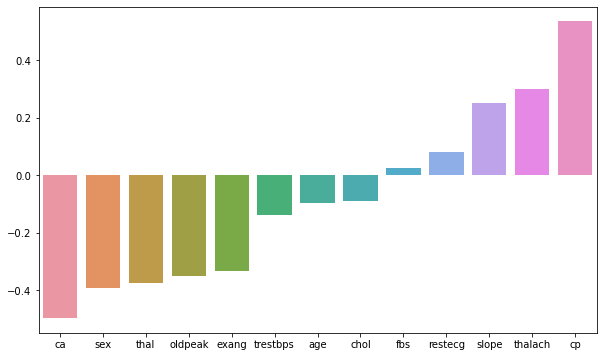
Model Performance Evaluation
TASK: Let's now evaluate your model on the remaining 10% of the data, the test set.
TASK: Create the following evaluations:
- Confusion Matrix Array
- Confusion Matrix Plot
- Classification Report
# CODE HEREfrom sklearn.metrics import confusion_matrix,classification_report,plot_confusion_matrixy_pred = log_model.predict(scaled_X_test)confusion_matrix(y_test,y_pred)array([[12, 3],
[ 2, 14]], dtype=int64)# CODE HEREplot_confusion_matrix(log_model,scaled_X_test,y_test)<sklearn.metrics._plot.confusion_matrix.ConfusionMatrixDisplay at 0x2573dba6e08>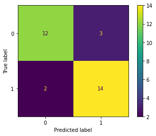
# CODE HEREprint(classification_report(y_test,y_pred)) precision recall f1-score support
0 0.86 0.80 0.83 15
1 0.82 0.88 0.85 16
Performance Curves
TASK: Create both the precision recall curve and the ROC Curve.
from sklearn.metrics import plot_precision_recall_curve,plot_roc_curve# CODE HEREplot_precision_recall_curve(log_model,scaled_X_test,y_test)<sklearn.metrics._plot.precision_recall_curve.PrecisionRecallDisplay at 0x2573dc46cc8>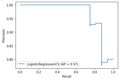
# CODE HEREplot_roc_curve(log_model,scaled_X_test,y_test)<sklearn.metrics._plot.roc_curve.RocCurveDisplay at 0x2573dc484c8>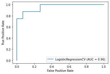
Final Task: A patient with the following features has come into the medical office:
age 48.0 sex 0.0 cp 2.0 trestbps 130.0 chol 275.0 fbs 0.0 restecg 1.0 thalach 139.0 exang 0.0 oldpeak 0.2 slope 2.0 ca 0.0 thal 2.0
TASK: What does your model predict for this patient? Do they have heart disease? How "sure" is your model of this prediction?
For convience, we created an array of the features for the patient above
patient = [[ 54. ,   1. ,   0. , 122. , 286. ,   0. ,   0. , 116. ,   1. ,
3.2, 1. , 2. , 2. ]]X_test.iloc[-1]age 54.0
sex 1.0
cp 0.0
trestbps 122.0
chol 286.0y_test.iloc[-1]0log_model.predict(patient)array([0], dtype=int64)log_model.predict_proba(patient)array([[9.99999862e-01, 1.38455917e-07]])